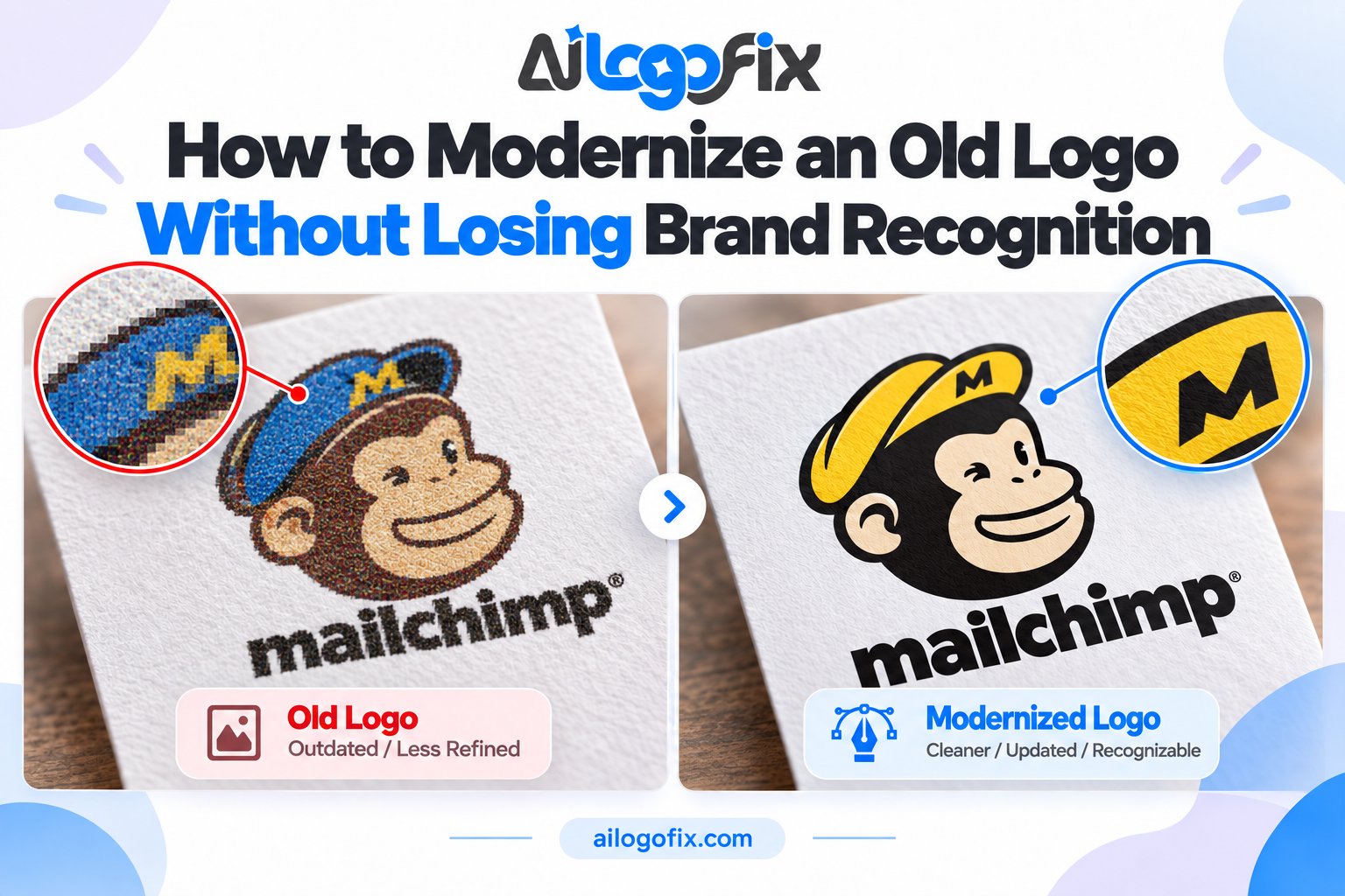
How to Modernize an Old Logo Without Losing Brand Recognition
Your logo has served you for years — maybe decades. But lately it looks tired next to competitors: dated fonts, fussy details, colors from another era. You want a fresh look, but you are afraid of losing the recognition you have built.
In This Guide
- Why Old Logos Start Working Against You
- What to Keep: Your Recognition Anchors
- The 6 Modernization Moves That Work
- How Designers Modernize a Logo (Step by Step)
- Real-World Examples of the Principle
- Mistakes to Avoid
- FAQs
- Modernize Old Logo: Frequently Asked Questions
- 5 Modernize Old Logo Mistakes to Avoid
- Pro Tips: Modernize Old Logo Work Like a Strategist
- When to Hire a Designer to Modernize Old Logo Work
- Modernize Old Logo Checklist
That fear is healthy. The goal when you modernize an old logo is evolution, not revolution — keep what customers recognize, fix what dates you, and end up with a mark that feels both familiar and current.
Quick answer: To modernize a logo without losing recognition, keep its most distinctive elements (core shape, key colors, name treatment), then simplify details, update typography, refine colors, and rebuild everything as clean vector artwork. Test the new version against the old with real customers before committing.
Why Old Logos Start Working Against You
Logos age for predictable reasons: gradients and bevels from the 2000s, clip-art style icons, overly complex illustrations, thin delicate type that fails on screens, and color palettes chosen for print catalogs rather than digital feeds.
None of this means your brand is bad — it means the visual language around it moved on. Customers unconsciously read a dated logo as a dated business. Modernizing is maintenance, like repainting a storefront.
What to Keep: Your Recognition Anchors
Before changing anything, identify what makes your logo recognizable. These are your anchors — the elements loyal customers would miss:
1. The core silhouette or symbol. If people recognize your mark by its shape alone (the apple with a bite, the golden arches), that shape stays.
2. The brand colors — or their spirit. You can refine shades without abandoning the palette. A dusty 90s teal can become a confident modern teal; customers still see “your” color.
3. The name treatment. If your wordmark is well known, keep its personality — you can redraw the letters cleaner without changing their character.
4. Any distinctive detail people mention. Ask customers what they picture when they think of your logo. Whatever they name first is untouchable.
The 6 Modernization Moves That Work
| Move | What changes | What stays |
|---|---|---|
| Simplify | Remove fussy details, tiny elements, background clutter | The core symbol and composition |
| Flatten | Replace gradients, bevels, and shadows with clean flat color | Color identity (refined, not replaced) |
| Retype | Swap dated fonts for a current typeface with similar personality | Name, capitalization, and general feel |
| Re-space | Fix cramped kerning and awkward proportions | The lockup arrangement customers know |
| Recolor | Brighten muddy tones, define exact CMYK/Pantone builds | The recognizable palette family |
| Rebuild | Redraw everything as clean, precise vector geometry | Every visual decision above it |
How Designers Modernize a Logo (Step by Step)
Step 1: Audit the current logo
The designer studies your existing logo at every size and use: website header, business card, signage, social avatar. Dated elements get flagged; recognition anchors get protected. If you only have a low-resolution file, this is also when it gets rebuilt as a vector so there is clean artwork to work from.
Step 2: Define what must not change
Together you agree on the untouchables — usually two or three elements. Writing them down prevents the redesign from drifting into “new logo” territory.
Step 3: Explore controlled variations
The designer produces directions that all respect the anchors: a conservative cleanup, a moderate refresh, and a bolder take. Seeing the range helps you calibrate how far to go.
Step 4: Refine typography and color
This is where most of the modernization happens. Letterforms get redrawn with contemporary proportions; colors get tuned for both screens (RGB) and print (CMYK/Pantone) so the new logo works everywhere.
Step 5: Test recognition
Show the new version to people who know your brand — alongside the old one, and alone. If they recognize it instantly without the old one beside it, the anchors held.
Step 6: Build the full file package
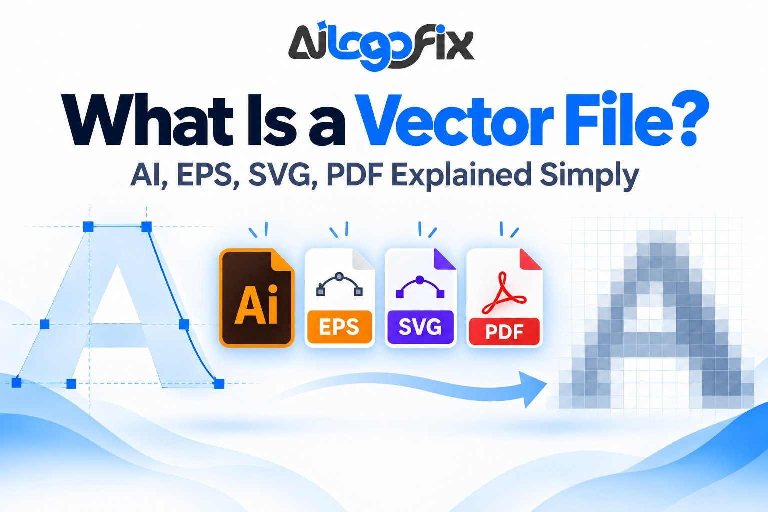
The final modernized logo is delivered as a complete professional set: vector sources, print and web versions, color variants. Learn what that includes in What Is a Vector File?
Real-World Examples of the Principle
Think of the great logo evolutions: brands that simplified an illustration into a clean mark, flattened a glossy badge, or redrew a wordmark with fresher letterforms — while keeping the shape, colors, and name everyone knew. Each change looked obvious after the fact, which is exactly the point: customers felt the brand had freshened up, not changed identity.
The failures teach the same lesson in reverse: redesigns that abandoned the anchors — new colors, new symbol, new name style all at once — read as a different company and had to be walked back.
Mistakes to Avoid
Do not change everything at once. New symbol plus new colors plus new font equals a new brand, not a refresh. Change two or three things; keep the rest.
Do not follow trends blindly. Today’s trendy minimalism is tomorrow’s dated look. Aim for timeless simplicity, not the current fad.
Do not skip the vector rebuild. A modernized logo still trapped in a low-resolution file is not modernized — it is just a prettier pixel image. The refresh must end in real production files.
Do not redesign by committee vote alone. Feedback is essential, but design-by-poll produces mush. Gather input, then let the designer decide.
Do not forget the rollout. Plan where the new logo appears first (website, social profiles), then work through packaging, signage, and documents. A phased rollout avoids the “two logos” confusion period.
We Will Modernize Your Logo — Without Losing What Makes It Yours
Send us your current logo. Our designers will identify your recognition anchors, refresh the dated elements, and rebuild everything as clean vector artwork — a logo that feels new but still unmistakably you.
FAQs
How do I know if my logo needs modernizing?
If it looks out of place next to competitors, fails at small sizes, relies on dated effects (heavy gradients, bevels, clip-art styling), or only exists as a low-resolution file — it is time.
Will customers still recognize my brand after a refresh?
Yes, if the recognition anchors are protected. That is the entire discipline of logo modernization: change the dated parts, keep the memorable parts.
Should I keep my brand colors?
Usually yes — refined, not replaced. Colors carry enormous recognition value. Update the exact shades and define proper print builds rather than switching palettes.
Can you modernize a logo from a low-resolution file?
Yes. The process starts by rebuilding your logo as clean vector artwork, which then becomes the base for the modernized version. Even a blurry JPG or old print scan works as a starting point.
How long does a logo refresh take?
It depends on complexity and revision rounds. A straightforward cleanup is quick; a full exploration with multiple directions takes longer. Message our team with your current logo for a realistic timeline.
Is modernizing cheaper than a full redesign?
Generally yes — you are refining existing equity rather than inventing from zero. If the current concept is fundamentally wrong for your market, though, a fresh custom logo design may be the better investment.
The bottom line: A good logo modernization feels like meeting an old friend who got a great haircut — familiar, but sharper. Protect your anchors, simplify what dates you, rebuild it all as proper vector artwork, and your brand gets another decade of life.
Modernize Old Logo: Frequently Asked Questions
Everything business owners ask before they modernize old logo designs, answered straight.
What does it mean to modernize old logo designs?
To modernize old logo artwork means refreshing a dated logo so it looks current while keeping the brand recognizable. It is not a full redesign: the core shapes, colors, or concept usually stay, but clunky details get cleaned up. Think simpler geometry, better typography, and colors tuned for screens. Brands modernize old logo designs when the existing mark feels stuck in a past decade, looks bad on mobile, or no longer matches the company’s quality. Done well, customers see evolution, not a stranger.
How do I modernize old logo work without losing brand recognition?
Keep one strong anchor from the original: the distinctive shape, the signature color, or the wordmark style. When you modernize old logo assets, change the supporting details around that anchor. If your mark is known for a particular icon, keep the icon’s silhouette but redraw it with cleaner lines and better proportions. If the name is the asset, keep the name but upgrade the typography. Change no more than 30 to 40 percent of the visual DNA in one refresh, and test the result with real customers before committing.
How much does it cost to modernize old logo designs?
A professional modernize old logo project typically costs between $150 and $1,500 depending on scope. A light refresh (cleaner lines, better font, color tune-up) sits at the lower end. A deeper modernization with multiple concepts, full brand guidelines, and file packages costs more. Freelance marketplaces go cheaper but quality varies wildly. Remember that a logo refresh touches everything: signage, packaging, websites, and social profiles. Budget for the rollout, not just the design.
How long does a logo modernization take?
Most modernize old logo projects take one to three weeks. A simple cleanup can finish in days. A strategic refresh with customer testing and multiple revision rounds takes longer. The timeline stretches when stakeholders disagree, so align decision-makers on goals before design starts. Rushing a modernize old logo project leads to timid, committee-weakened results. Give the process room to breathe.
Should I modernize old logo files myself or hire a designer?
If you have real design skill and the logo is simple, a careful DIY refresh can work. But most business owners who try to modernize old logo artwork themselves end up with something that looks amateur next to competitors. Typography, spacing, and proportion are subtle crafts. A professional brings objectivity too: you are attached to your logo, and that attachment blinds you to what actually needs changing. For any customer-facing brand, hire the refresh out.
What are the signs my logo needs modernizing?
Your logo needs you to modernize old logo elements when it looks blurry on your own website, uses gradients and bevels from the 2000s, fails at small sizes, or embarrasses you next to competitors. Other signs: the original files are lost and you are working from a stretched JPG, the colors print differently everywhere, or new customers cannot read it on mobile. If your team avoids putting the logo on new materials, that avoidance is your answer.
Will customers be confused if I modernize old logo designs?
Not if you evolve instead of replacing. Customers accept a modernize old logo refresh easily when the core identity stays familiar. Announce the refresh positively: frame it as growth, not correction. Roll it out consistently across all touchpoints at once, because a half-updated brand (new logo on the website, old logo on the van) confuses people far more than the redesign itself. Major brands refresh every 7 to 10 years, and customers barely blink when the evolution respects what they already know.
5 Modernize Old Logo Mistakes to Avoid
1. Changing everything at once. A full redesign disguised as a refresh confuses loyal customers. When you modernize old logo designs, protect the equity you have built. Fix: evolve one or two elements per refresh cycle and keep the most recognizable feature untouched.
2. Following trends instead of strategy. Minimal geometric marks are fashionable now, but stripping all character to chase a trend leaves you generic. A modernize old logo project should solve real problems (legibility, scalability, relevance), not mimic whatever is popular this year. Fix: define three functional goals for the refresh before looking at any design references.
3. Forgetting where the logo actually lives. A refresh that looks great on a white artboard can fail on your delivery van, embroidered uniform, or app icon. To modernize old logo work properly, audit every real-world application first. Fix: mock up the refreshed logo on your five most important touchpoints before finalizing anything.
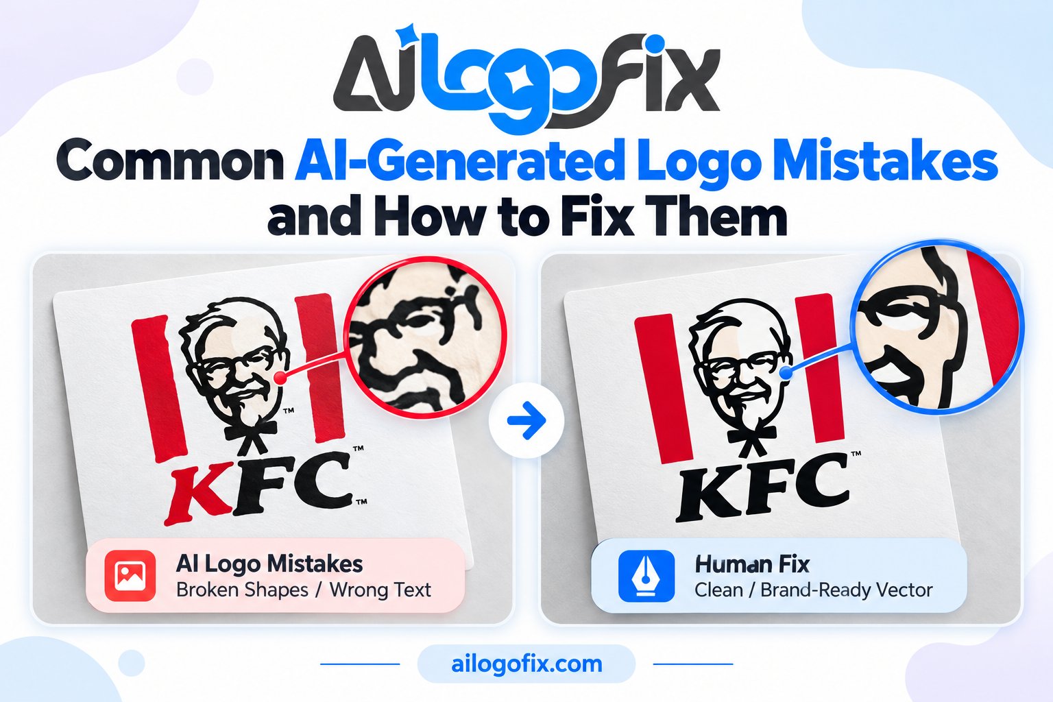
4. Keeping the bad typography. Dated fonts are the fastest way to age a logo. Many owners who modernize old logo marks keep the original typeface out of sentimentality, and the refresh falls flat. Fix: be ruthless with type. A contemporary, well-kerned typeface does more modernizing work than any icon tweak. The history of logo design shows type upgrades driving most successful refreshes.
5. Skipping the file rebuild. A visual refresh without proper vector files is theater. If you modernize old logo artwork, rebuild it as clean vector files in correct color modes with full format packages. Fix: deliver AI, EPS, SVG, PDF, and PNG files, in CMYK for print and RGB for screen, so the refresh actually works everywhere.
Pro Tips: Modernize Old Logo Work Like a Strategist
Start your modernize old logo project with a brand audit, not a sketchbook. List what customers recognize, what competitors look like, and where the current logo fails technically. This audit becomes the brief, and it prevents subjective redesign-by-committee.
Simplify in passes. First pass: remove one unnecessary element. Second pass: clean the geometry. Third pass: refine typography and spacing. Trying to modernize old logo designs in a single leap usually overshoots into unrecognizable territory. Gradual simplification preserves equity.
Test at 16 pixels and at 16 feet. A modernized logo must work as a favicon and as signage. If fine details vanish small or the mark looks empty large, adjust before you fall in love with the design. Every modernize old logo success survives this scale test.
Modernize the system, not just the mark. Update the color palette for screens, pick supporting fonts, and define clear-space rules. A modernize old logo effort that stops at the logo leaves every application looking dated anyway. The refresh should include a mini style guide so the new logo always appears correctly. Study how major brands evolve their identity over decades without losing recognition.
When to Hire a Designer to Modernize Old Logo Work
Hire a professional to modernize old logo designs when the brand has real customer equity, when the logo appears in print or signage, or when past DIY attempts look amateur. An outside designer sees your logo the way customers do, without the sentimental attachment that blocks necessary changes.
A good refresh service does more than redraw. It audits your current applications, presents concepts that preserve recognition, refines typography and color, and delivers complete production files. That full package is what makes a modernize old logo investment pay off across every touchpoint.
Watch for designers who want to throw everything away and start over. The right partner respects your brand history and evolves it. Ask to see before-and-after refresh work, not just from-scratch logos.
Ready for a refresh that keeps your customers? Our logo modify service specializes in careful logo modernization: cleaner geometry, better type, full vector files. Message our team for a free assessment of your current logo.
Modernize Old Logo Checklist
- Audit current logo: list what customers recognize most
- Document every place the logo appears (print, web, signage, packaging)
- Define 3 functional goals before any design work starts
- Keep the single most recognizable element as your anchor
- Change no more than 30-40 percent of the visual DNA
- Upgrade typography ruthlessly; fix kerning and spacing
- Simplify geometry in gradual passes, not one leap
- Test the refresh at favicon size and at signage size
- Mock up the new logo on your top 5 real-world touchpoints
- Rebuild everything as clean vector files (AI, EPS, SVG, PDF, PNG)
- Provide CMYK versions for print and RGB for screen
- Get feedback from real customers, not just your team, before launch