
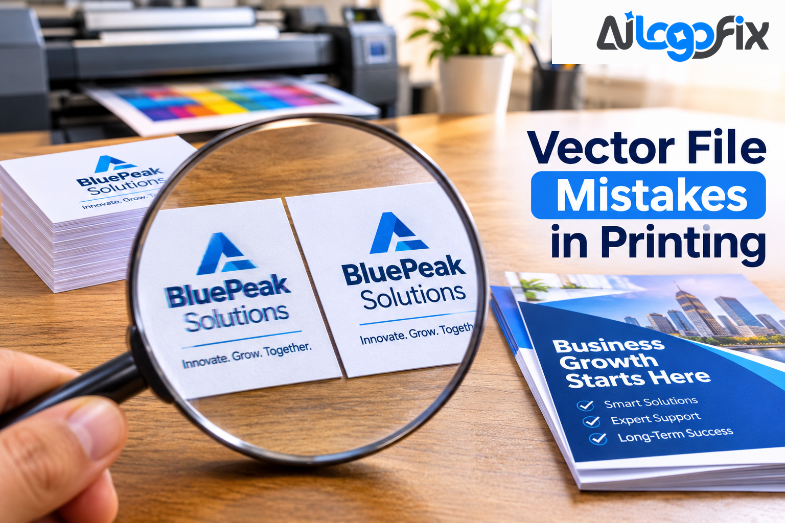
You did everything right. The design looks great on screen. Then the prints arrive — and the text is wrong, the colors are off, or the edges are cut. Most print disasters are not design problems. They are file problems, and they are almost always one of seven mistakes.
Vector files are supposed to make printing easy: they scale forever and stay sharp. But a vector file prepared the wrong way can cause just as much trouble as a low-resolution JPG. Here are the seven mistakes that ruin prints — and how to avoid each one.
Mistake 1: Sending a Raster File Disguised as a Vector
This is the most common mistake of all. A JPG saved with an EPS or PDF extension is still a raster image — pixels inside a new wrapper. Renaming or re-saving a file never converts it. The printer opens your "vector" file, finds pixels, and either rejects it or prints a blurry result.
How to avoid it: a real vector file contains paths, not pixels. Open the file and zoom in — if the edges stay sharp at 800%, it is vector. If they turn into squares, it is raster wearing a vector filename. When in doubt, have the artwork properly traced. AiLogoFix's raster to vector service rebuilds pixel logos as true vector files from $10, so the file you send is genuinely vector.
Mistake 2: Leaving Text as Live Fonts
Fonts are one of the most common troublemakers in prepress. If your fonts are not embedded or outlined, the printer's system may not have them — and it will substitute a different font, shifting your layout and changing your design. A headline in the wrong font is not a small problem; it changes the entire look of the piece.
How to avoid it: convert all text to outlines before sending files to print. Outlining turns letters into fixed vector shapes that never shift, so every printed piece looks the same. Keep one master copy with live text for future edits — once text is outlined, it cannot be edited as text — and send the outlined copy to the printer. As the prepress checklist from Bergen County Printers notes, outlining is the safer option when you cannot guarantee the printer has your fonts, and it also avoids font licensing problems that embedding can cause.
Mistake 3: Using RGB Colors Instead of CMYK
Screens display color in RGB. Printers print in CMYK. A bright RGB blue that looks electric on your monitor can print as a dull purple, because the CMYK color range cannot reproduce it. This is the single biggest cause of "the colors came out wrong."
How to avoid it: set your document and all elements to CMYK before you design, using the color profile your printer recommends. Check every element — a single RGB image placed inside a CMYK document can still shift the result. And remember that some effects, like glows and transparencies, can introduce RGB data even in a CMYK file. If color accuracy matters — and for a logo, it always does — ask your printer which CMYK profile they use, and design to it.
Mistake 4: Too Many Anchor Points From a Bad Auto-Trace
Excess anchor points make curves harder to adjust and leave small bumps along an otherwise smooth outline. Automatic tracing deserves the same inspection as manually drawn paths — that warning comes from DigitEMB's guide to common vector graphics mistakes, and it is one that print shops repeat constantly.
An auto-traced logo can carry hundreds of unnecessary anchor points on a single curve. The file becomes heavy and slow to edit, the edges print with tiny lumps, and cutting machines follow every wobble. How to avoid it: simplify your paths before export, and check the point count on your curves. A clean trace uses the minimum number of points that hold the shape. If your logo was auto-traced and the paths look messy, get it redrawn by hand — it is cheaper than reprinting a bad job.
Mistake 5: Forgetting Bleed and Safe Margins
Printers cut your cards, flyers, and brochures with a blade, and the blade is never perfectly precise. If your background color or image stops exactly at the trim edge, a tiny shift leaves a white sliver along the cut. That is what bleed prevents.
How to avoid it: extend your design at least 0.125 inches beyond the trim edge on all sides, and keep critical elements — text, logos, anything that must not be cut — at least 0.125 inches inside the trim area. Those are the figures in Bergen County Printers' prepress checklist, and they match what most commercial printers require. Business cards are the worst offenders here, because the card is small and the margins are tight. If you are ordering cards, the business card design service delivers them with proper bleed and margins already set — 300 DPI, CMYK, print-ready from $15.
Mistake 6: Leaving Effects and Transparency Unflattened
Shadows, glows, and blurs look great on screen. In a vector file, many of these effects generate raster data — which means their quality depends on resolution even when the underlying shapes are vector. Unflattened transparency can also confuse a printer's RIP software, producing missing elements, moved layers, or invisible effects on the final print.
How to avoid it: flatten transparency and effects before export, and keep effects subtle. Heavy shadows and low-opacity layers are the worst offenders. If an effect is essential to the design, flatten it at high resolution and check the result at full size. And if your logo has a white background baked in, remove it properly — a white box printed around a design on a colored shirt or card is one of the most visible amateur mistakes there is.
Mistake 7: Sending the Wrong Format — or No Editable Master
Every print job needs the right file. Sending a JPG to a screen printer, an RGB PNG to an offset printer, or a flattened file with no editable master all cause the same problem: the printer cannot do their job properly, and the result suffers.
How to avoid it: keep a complete editable master file (AI or EPS) and export delivery copies for each use. Ask the printer what they need before you send anything — most want AI, EPS, or PDF with outlined fonts and CMYK colors. Never send your only copy of a file; always keep the master. And if your logo needs changes before print — new colors, resized text, a layout fix — get them done first. The logo modify service handles exactly that, from $15.
The Pre-Send Checklist
Run through this list before you send any file to print:
- [ ] The file is true vector — zoom to 800% and the edges stay sharp
- [ ] All text is converted to outlines (and you kept a live-text master)
- [ ] All colors are CMYK, using your printer's recommended profile
- [ ] Paths are clean — no excess anchor points, no stray points
- [ ] Bleed extends 0.125 inches past the trim on all sides
- [ ] Text and logos sit at least 0.125 inches inside the trim
- [ ] Effects and transparency are flattened
- [ ] Backgrounds are transparent where they should be — no white box
- [ ] The file is saved in the format your printer asked for (usually AI, EPS, or PDF)
Five minutes with this checklist saves a reprint, a missed deadline, and a wasted budget.
FAQ
Why did my printer reject my vector file?
Most often because the file is not really vector — a JPG renamed as EPS or PDF — or because it contains live fonts, RGB colors, or unflattened effects. Ask the printer what specifically failed, then fix that item on the checklist above.
Should I outline text or embed fonts?
Outlining is safer for print: the text becomes fixed shapes that cannot shift. Embedding works too, but only if you hold the proper font license. Either way, keep a master copy with live text for future edits.
What is bleed, and how much do I need?
Bleed is the extra design area that extends past the trim edge so cutting variations never leave a white sliver. Extend backgrounds and images at least 0.125 inches beyond the trim on all sides.
Can I fix a bad vector file, or do I need a new one?
Most file problems can be fixed by cleaning the paths, converting text to outlines, and correcting the color mode. But if the file is an auto-traced mess with hundreds of anchor points, a clean manual redraw is faster and cheaper than repair.
What format should I send to a printer?
AI, EPS, or PDF with outlined fonts and CMYK colors is the standard. Confirm with your printer — some prefer one format over the others, and older RIP software may need a legacy file version.
Conclusion
Perfect print results are not about talent. They are about files: true vector paths, outlined text, CMYK colors, clean anchor points, proper bleed, flattened effects, and the right format. Every one of the seven mistakes in this post is preventable, and the checklist above catches all of them in five minutes.
The most expensive print job is the one you have to do twice. Check the file before you send it — or let someone who does this every day prepare it for you.
Send it right the first time — no reprints, no surprises.
Your print job deserves a file that prints exactly as designed. AiLogoFix's specialist team prepares clean, print-ready vector files — true paths, outlined text, CMYK colors, and proper bleed — so your cards, flyers, and banners come back perfect. Every order includes refinements within your selected package and agreed brief, and full commercial rights.
Get a Print-Ready Vector File →
Not sure your file is ready for print? Message the team — send your file and we will tell you exactly what it needs, for free.