Introduction
Your logo is the first thing people notice about your brand — and the last thing they forget. But with so many types of logo design out there, how do you pick the one that actually fits? Get it right, and your logo builds instant trust, recognition, and personality. Get it wrong, and even a great product can feel forgettable.
In This Guide
- Introduction
- Type 1: Wordmark (Logotype)
- Type 2: Lettermark (Monogram)
- Type 3: Icon or Symbol (Brand Mark)
- Type 4: Abstract Logo Mark
- Type 5: Combination Mark
- Type 6: Emblem Logo
- Type 7: Mascot Logo
- Type 8: Dynamic Logo
- Type 9: Pictorial Mark
- Type 10: Minimalist Logo
- Type 11: Letterform Logo
- Type 12: Vintage / Retro Logo
- How to Choose the Right Type of Logo Design for Your Brand
- Get a Logo Designed for Your Brand
- Types of Logo Design FAQs
- 5 Mistakes When Choosing Types of Logo Design
- Pro Tips for Picking Your Logo Type
- When to Hire a Designer for Your Logo Type
- Logo Design Glossary
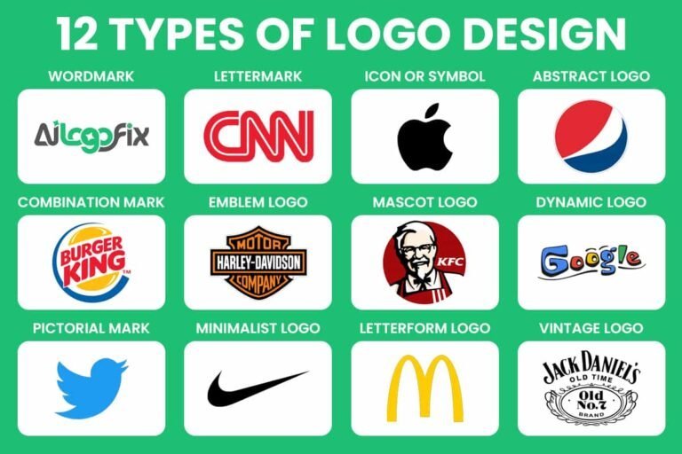
The good news: you don’t have to guess. In this guide, we’ll walk through the 12 main types of logo design, explain exactly when to use each one, and point to a famous brand that proves it works. By the end, you’ll know precisely which style suits your brand — let’s dive in.
Type 1: Wordmark (Logotype)
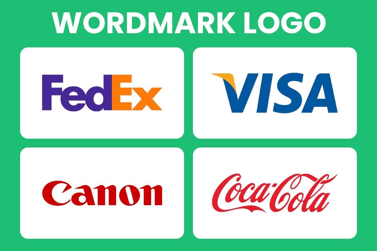
Of all the types of logo design, the wordmark is the most straightforward: your brand name, set in distinctive typography, with no icon attached. The letters do all the talking. Every time someone sees the logo, they read — and remember — exactly who you are.
When to choose it: Your business name is short, catchy, and easy to spell, and you want maximum name recognition without visual clutter.
A brand that nails it: Google — its colorful wordmark is recognized worldwide, no icon needed.
Type 2: Lettermark (Monogram)
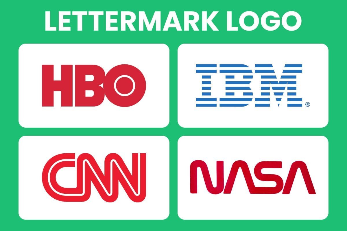
A lettermark shrinks a long company name down to its initials, designed as a sleek typographic mark. It’s the minimalist’s answer to the wordmark — all the identity, a fraction of the letters. When the letterforms are crafted well, two or three characters can carry as much weight as a full name.
When to choose it: Your company name is long, hard to pronounce, or made of several words — initials are easier to remember and look sharper on everything from business cards to app icons.
A brand that nails it: HBO — three bold letters that instantly signal premium entertainment.
Type 3: Icon or Symbol (Brand Mark)
A brand mark drops words entirely and speaks through a single image or symbol. It’s the boldest move among the types of logo design: no name, no initials — just an icon carrying the whole brand. When it works, it’s unforgettable, recognizable across a crowded street or a tiny phone screen.
When to choose it: Your brand already has strong recognition (or is building it fast), and you want a universal mark that works across languages and cultures.
A brand that nails it: Apple — the bitten apple needs no words to tell you whose product you’re holding.
Type 4: Abstract Logo Mark
An abstract mark uses shapes, lines, and geometry that depict nothing literal — instead, they suggest a feeling, an idea, or a value. A swirl hinting at motion, interlocking forms suggesting connection. Because it’s open to interpretation, an abstract mark gives your brand a signature no competitor can copy.
When to choose it: You want something completely unique and would rather evoke emotion than illustrate your product.
A brand that nails it: Pepsi — its abstract globe has evolved for decades while always feeling energetic and modern.
Type 5: Combination Mark

A combination mark pairs text with imagery — a wordmark or lettermark sitting beside a symbol. It’s the best of both worlds: the icon gives you visual personality while the name makes sure nobody forgets who you are. As your brand grows, the two elements can split apart and work independently.
When to choose it: You’re building a new brand and want flexibility — the full lockup for your website header, just the icon for social avatars and favicons.
A brand that nails it: Burger King — the wordmark tucked between the bun halves works as one logo or as separate pieces.
Type 6: Emblem Logo
An emblem locks your brand name inside a defined shape — a badge, crest, or seal. It’s the most traditional of all the types of logo design, carrying heritage, authority, and craftsmanship in every line. Emblems feel official and established, which is why this style has barely changed in a century of design trends.
When to choose it: Tradition and trust sit at your brand’s core — schools, breweries, sports clubs, and heritage businesses that want to feel established from day one.
A brand that nails it: Harley-Davidson — its shield emblem shouts legacy, loyalty, and rebellion all at once.
Type 7: Mascot Logo
A mascot logo turns your brand into a character — illustrated, expressive, and full of personality. Mascots pull off something no other logo type can: they give your audience someone to like. A friendly face makes a brand feel approachable and human, which is marketing gold.
When to choose it: Your audience includes families or young people, or your brand voice is playful and you want a character that can star in ads, packaging, and social media.
A brand that nails it: KFC — Colonel Sanders’ smiling face has been selling chicken and friendliness for generations.
Type 8: Dynamic Logo
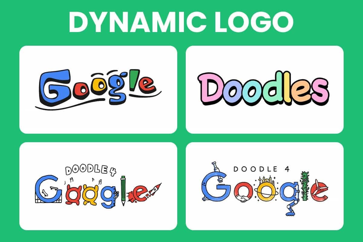
A dynamic logo refuses to sit still. Instead of one fixed design, it’s a flexible identity system — colors, patterns, or shapes that shift with context while one recognizable core stays constant. It’s branding built for the digital age, where a logo might appear as an app icon, a billboard, and an animation all in the same day.
When to choose it: You’re a tech company, creative studio, or media brand that wants to feel alive, current, and constantly evolving.
A brand that nails it: Google — its ever-changing Doodles prove a logo can play around without losing its identity.
Type 9: Pictorial Mark
Few types of logo design create faster recognition than a pictorial mark: a recognizable real-world image — an animal, an object, a force of nature — used as your brand’s symbol. People instantly know what they’re looking at, which creates an immediate mental shortcut to your brand. The trick is picking imagery that genuinely connects to what you do or stand for.
When to choose it: You want instant visual recognition and have a concrete image that captures your brand’s spirit.
A brand that nails it: Shell — a simple seashell, impossible to confuse with anyone else in its industry.
Type 10: Minimalist Logo

Minimalist logos strip everything back to essentials: clean lines, simple shapes, zero decoration. It’s harder than it looks — with nothing to hide behind, every curve and gap has to be perfect. The payoff is a logo that feels confident and modern, stays legible at any size, and never goes out of style.
When to choose it: Your brand values clarity and sophistication, or your logo must work everywhere from a tiny favicon to a billboard without losing impact.
A brand that nails it: Nike — the swoosh is a single simple stroke, yet it’s among the most recognized marks on Earth.
Type 11: Letterform Logo
Among the types of logo design, the letterform is the most compact: an entire logo built from a single letter — usually your brand’s initial, drawn or customized until it’s unmistakable. It’s bold, space-efficient, and made for the small canvases of modern branding: profile pictures, favicons, and app icons.
When to choose it: You need a mark that stays readable at tiny sizes, or you want a strong secondary logo to pair with your full wordmark.
A brand that nails it: McDonald’s — the golden arches “M” is visible (and craveable) from a mile away.
Type 12: Vintage / Retro Logo
Rounding out our tour of the types of logo design, vintage and retro logos borrow from the past: classic typography, ornate details, distressed textures, old-school badges. They trade on nostalgia and craftsmanship, telling customers you do things the real way. In a world of flat digital design, a well-crafted retro logo stands out precisely because it feels human and handmade.
When to choose it: You’re an artisanal brand — a café, brewery, barbershop, or boutique — where heritage, craft, and authenticity are the selling points.
A brand that nails it: Jack Daniel’s — its old-timey label pours the whiskey’s heritage into every bottle.
How to Choose the Right Type of Logo Design for Your Brand
Still torn between the 12 types of logo design? Run through these three questions:
1. How distinctive is your name? Short and catchy points to a wordmark. Long or complicated points to a lettermark or letterform.
2. How established are you? New brands usually need their name visible — wordmarks and combination marks do that job. Household names can afford to go symbol-only.
3. What should people feel? Playful and friendly points to a mascot or dynamic logo. Premium and timeless points to minimalist or emblem. Craft and heritage points to vintage.
And remember, these types of logo design aren’t strict rules — many great logos blend styles. A combination mark can carry a vintage feel; a minimalist logo can hide a clever letterform. Use this guide as your starting point, not a cage.
Get a Logo Designed for Your Brand
Knowing the types of logo design is step one — step two is getting a logo crafted for your brand, not pulled from a template. At AiLogoFix, our designers create custom, professional logos tailored to your industry, audience, and personality. Take a look at our logo design services and see what we can do for you.
Ready for a logo that truly represents your brand?
Struggling with your current logo, or starting completely from scratch? The specialist team at AiLogoFix is ready to solve your logo problems. With 4,000+ completed logo projects and unlimited revisions, we’ll refine your design until it’s perfect.
Not sure which style fits you yet? Or message the AiLogoFix team — we’ll happily help you choose the perfect type of logo design for your brand.
Types of Logo Design FAQs
Straight answers to the most common questions about types of logo design.
How many types of logo design are there?
Designers generally recognize seven core types of logo design: wordmark, lettermark, pictorial mark, abstract mark, mascot, emblem, and combination mark. Some taxonomies add sub-variants, but these seven cover nearly every professional identity. Knowing the types of logo design helps you brief a designer precisely instead of waving vaguely at “something modern.” It also keeps you from paying for a mascot when a wordmark would serve you better.
Which types of logo design work best for small businesses?
Combination marks and wordmarks are the safest types of logo design for small businesses. A combination mark pairs your name with an icon, so customers learn both at once. Wordmarks work when your business name is short and distinctive. Among the types of logo design, these two give you maximum flexibility across signage, social profiles, invoices, and packaging without expensive redesigns later.
What is the difference between a pictorial mark and an abstract mark?
Both are icon-based types of logo design, but a pictorial mark depicts something recognizable (an apple, a bird, a mountain), while an abstract mark uses pure geometry with no literal reference (think interlocking shapes or a unique swirl). Pictorial marks communicate faster; abstract marks are easier to trademark globally. When comparing these types of logo design, pick pictorial for instant meaning and abstract for distinctive ownability.
Can I combine different types of logo design?
Yes, and professionals do it constantly. A combination mark is literally one of the types of logo design built for this: wordmark plus icon. You can also create responsive logo systems where a full combination mark simplifies to a lettermark at small sizes. Mixing types of logo design thoughtfully gives you a flexible identity; mixing them randomly gives you a mess. Keep one primary lockup and derive the rest.
Do the types of logo design affect trademark registration?
They can. Among the types of logo design, abstract marks and invented wordmarks are typically easiest to protect because they are inherently distinctive. Descriptive wordmarks (like “Quality Plumbing”) are hardest. Emblems with generic imagery also face tougher examination. If trademark strength matters to you, discuss the types of logo design with your designer before falling in love with a concept that cannot be protected.
5 Mistakes When Choosing Types of Logo Design
1. Copying a competitor’s type. If every rival uses an emblem, your emblem disappears into the crowd. Study which types of logo design dominate your niche, then deliberately zig where they zag.
2. Picking a mascot you cannot maintain. Mascots are charming types of logo design, but they demand consistent illustration across every touchpoint. If you cannot afford ongoing illustration work, choose a simpler mark.
3. Using a detailed emblem at favicon size. Intricate types of logo design like emblems collapse into mush at 32 pixels. Always test your logo at the smallest size it will ever appear before committing.
4. Choosing trendy abstract marks with no meaning. Abstract types of logo design need a story or they read as decoration. If you cannot explain what the mark represents in one sentence, simplify it.
5. Locking one type forever. Brands evolve. The types of logo design you start with can mature: many famous brands simplified from emblems to wordmarks over decades. Build a system that can shed detail as you grow.
For background on how marks evolved, see the history of logos on Wikipedia.
Pro Tips for Picking Your Logo Type
Match the type to your name. Long business name? A wordmark becomes unreadable, so lean toward a lettermark or combination mark. Short punchy name? Wordmarks shine. The types of logo design are tools, and your name length decides which tool fits.
Design in black and white first. Every one of the types of logo design must work in a single color before it earns its palette. If the concept fails in black, color will not save it.
When to Hire a Designer for Your Logo Type
Choosing among the types of logo design is a strategic decision, not just an aesthetic one. Hire a designer when your logo must work across print, web, signage, and merchandise, because each of the types of logo design behaves differently at different scales and in different media. A professional will also deliver true vector files, which matter enormously: a logo built from a low-resolution image will blur on your shop sign or vehicle wrap. If that is your situation, our raster to vector service rebuilds your existing logo as clean, scalable vector art. Ready to get it right? Message our design team and we will recommend the right logo type for your brand and budget.
Logo Design Glossary
Wordmark: A logo made entirely of the company name in styled type.
Lettermark: A logo built from initials, also called a monogram.
Pictorial mark: An icon depicting a recognizable real-world object.
Abstract mark: A non-representational geometric symbol.
Emblem: Text locked inside a badge, seal, or crest shape.
Combination mark: Wordmark plus icon used as a flexible pair.
Lockup: The fixed arrangement of logo elements and spacing.
Vector: Resolution-independent artwork defined by mathematical paths, essential for every one of the types of logo design.
See our guide to making your AI logo unique..
See our RGB vs CMYK vs Pantone guide.