Open any brand's website, then its Instagram, then its pitch deck. If the illustrations look like they came from three different companies, the brand has an illustration problem — not a talent problem. One-off illustrations drift. Each designer makes reasonable choices, and six months later the visuals have nothing in common except the logo in the corner.
The fix is an illustration pack: reusable SVG illustrations built on one visual language, so every new image looks like it belongs. Done right, a new landing page or social post can be illustrated in minutes — and the brand gets more recognisable every time someone sees it.
What an illustration pack actually is
An illustration pack is not a folder of pretty pictures. It is a system: a set of vector illustrations that share the same style rules, the same colours, the same level of detail, and the same building blocks — so any combination of them looks deliberate.
The key idea is modularity: instead of drawing each illustration from scratch, you build reusable components — characters, scenes, shapes, props, motifs — and assemble new illustrations from them. Change one component and the whole pack stays consistent; add a new illustration and it slots straight in.
And SVG is the right format for the job. Vector illustrations scale from a phone icon to a conference banner without losing sharpness, stay small in file size, and can be recoloured or edited in code. For web and UI work, SVG is the format illustrations should live in — PNG is the fallback for places that need raster transparency.
Step 1: Define the job and the personality first
Before drawing anything, decide what the illustrations are for. Illustrations should clarify content or add personality, and they should be used together with text to help understanding — not replace it. A pack for onboarding screens has a different job from a pack for social campaigns, and the style should follow the job.
Then define the brand personality in plain words. Is the brand precise, bold, warm, or playful? That choice drives every visual decision that follows: a precise brand gets geometric shapes and thin, exact lines; a warm brand gets rounded corners and soft shapes; a playful brand gets bolder colours and looser forms. Write the personality down in one or two sentences and keep it at the top of your style document — every future illustrator should read it before drawing anything.
Step 2: Lock the style rules
This is the step most packs skip, and it is the step that decides whether the pack stays consistent. Write down concrete rules for every visual element:
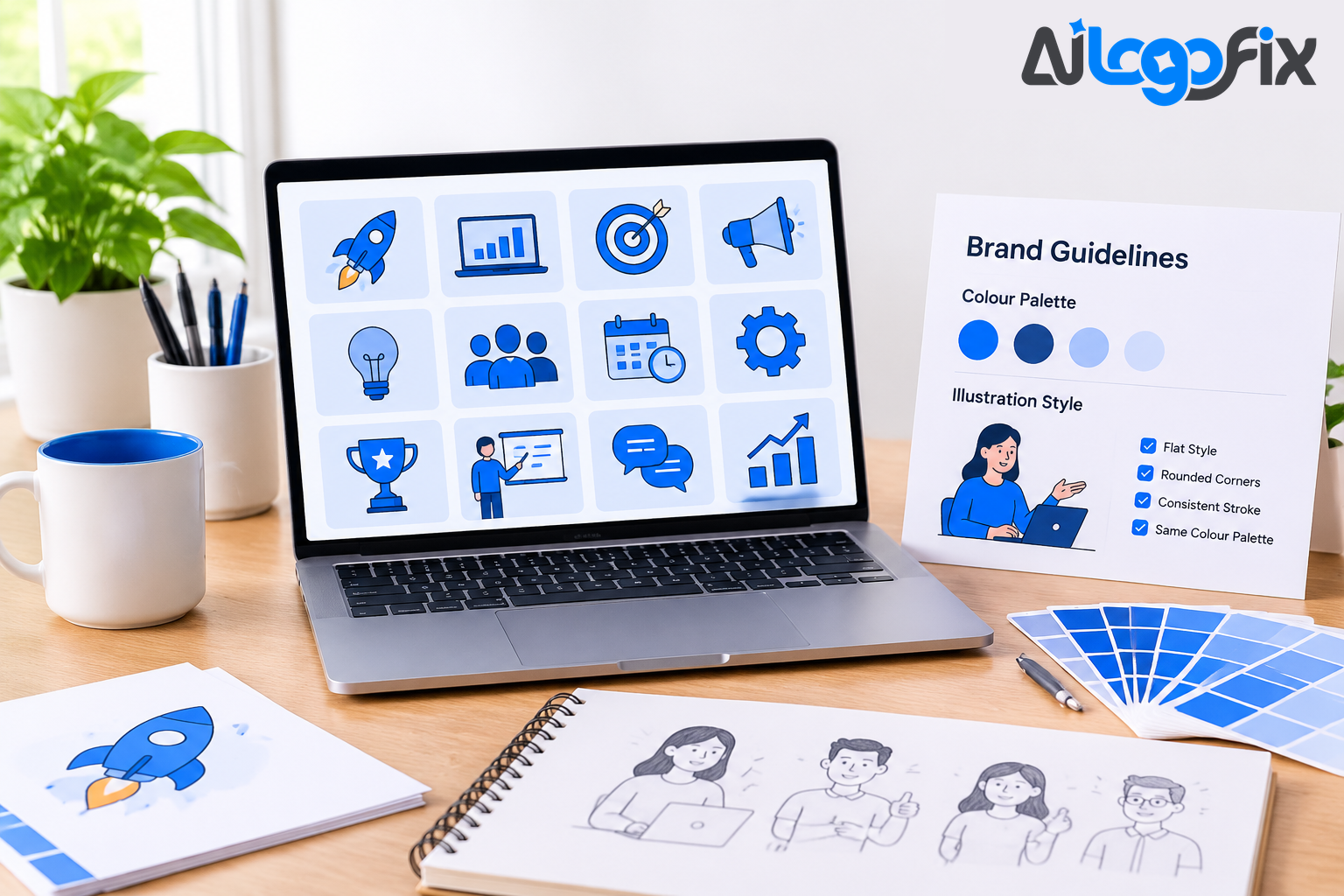
- Colour: pick a limited palette and stick to it. The CFPB's illustration guidelines, a widely referenced public design system, treat illustrations as vector-based brand assets and recommend a limited palette of up to three to four colours — and advise against complex effects such as gradients, textures, multiply, or blurs for shading. Fewer colours force better decisions and make the pack instantly recognisable.
- Line and shape: set the stroke weight, the corner radius, and the geometry. Are corners sharp or rounded? Are strokes thin and precise or thick and friendly? Are shapes geometric or organic? Pick one answer for each and write it down.
- Detail level: decide how much detail an illustration carries. A pack where one illustration is a simple two-shape icon and the next is a fully shaded scene will never look consistent, no matter how good each piece is.
- Characters: if the pack includes people, set anatomy rules — proportions, expressions, poses — before drawing the first one.
Document these rules with examples of what works and what does not. A style guide that only lists rules is easy to ignore; a style guide with side-by-side do and don't examples is hard to get wrong.
Step 3: Build reusable components
The heart of a modular pack is its components. Identify the recurring elements in your brand's visual storytelling and build them once, properly, as separate pieces: characters, scenes, shapes, props, and motifs. A hero illustration then becomes an assembly job — pick a background, add a character, place two or three props — instead of a fresh drawing.
Start with the pieces you will reuse most: a small set of characters in a few poses, a handful of background shapes, and the props that appear in your product's world. Ten well-built components produce more usable illustrations than fifty one-off drawings, because the combinations multiply. Keep the components in one shared file or library so nobody redraws what already exists.
Step 4: Derive everything from one seed
Consistency is easiest when every asset shares the same visual DNA. The practical way to do that is to start from one seed asset — usually the logo — and derive the rest of the pack from it. The logo's shapes, curves, and colours become the reference for every illustration that follows.
This is the same principle behind a complete brand kit: the primary logo is the seed design, and every other asset should be derived from it rather than generated from scratch. When each variant references the primary logo instead of starting fresh, the visual language holds together across the whole kit — logos, icons, social assets, and illustrations alike.
If your logo only exists as a JPG or PNG, that seed does not exist yet in usable form. AiLogoFix's raster to vector service redraws a pixel logo as clean vector artwork in AI, EPS, SVG, and PDF from $10 — the clean SVG master a pack should be built from. And if the logo itself needs to be created or rebuilt first, the logo design service creates original logos from $30, plus custom offers, delivered with the full vector package included.
Step 5: Organise files and naming like it matters
A pack is only as useful as its organisation. Without a logical structure, designers cannot find the assets they need, and they will draw new ones instead — which is how a pack falls apart.
Use a clear folder hierarchy — Illustrations, then Components, then Characters with one folder per character, or Illustrations, then Scenes, then one folder per scene type. Apply a consistent naming convention to every file and layer: a name such as illo-hero-welcome-01.svg tells the next designer everything; final-v2-new.svg tells them nothing.
Store the whole pack in one place where the whole team can reach it, and keep one master file per illustration. If the pack lives in three laptops and a chat thread, it does not exist.
Step 6: Export, check, and quality-gate
Choose export formats by destination. SVG is best for vectors on the web and in interfaces: it scales well and stays small. Use PNG when a destination needs raster transparency. Export every illustration at the sizes it will actually be used, and check each one at its smallest size — an illustration that looks great at 800 pixels and turns to mush at 48 pixels is not finished.
Then add a quality gate before anything ships: an intake note stating purpose, size, and placement; two to four rough concept thumbnails; a build from the component library; and a review against the style rules. The review checks the same things every time — palette colours, stroke weight, corner radius, detail level, and whether the illustration could sit next to any other in the pack without looking out of place.
Common mistakes that break a pack
- Too many styles. One flat illustration, one 3D render, and one hand-drawn sketch in the same pack is three brands, not one.
- Too many colours. Every new colour dilutes the brand. If an illustration needs a colour outside the palette, the palette is wrong — fix the palette, not the illustration.
- Gradients, textures, and blur effects. They look rich once and inconsistent forever, and they do not scale or recolour cleanly in SVG.
- No documentation. A pack without written rules depends on one person's memory, and it dies the day that person leaves.
- Stock illustrations used as-is. Recolour stock art to the palette, adjust it to the line rules, and add a branded element before it joins the pack — used unmodified, the brand starts looking like everyone else's.
- No do and don't examples. Rules without examples get interpreted five different ways by five designers.
How to keep a pack consistent when others help
The moment a freelancer or a new team member draws for the brand, the pack is tested. Hand them three things: the style rules with do and don't examples, the component library, and one existing illustration as the reference. Ask them to build from components before drawing anything new, and review their first illustration against the rules before they make five more. That one review saves more consistency than any rule document.
FAQ
How many illustrations should a starter pack have?
Start with ten to fifteen: a few hero scenes, a few spot illustrations, and the components they are built from. That is enough to cover a website's main pages and a month of social posts. Grow the pack by adding components and combinations, not by commissioning random one-offs.
Should illustrations be SVG or PNG?
SVG for anything on the web or in an interface — it scales, stays small, and can be recoloured. PNG only where a destination needs a raster file with transparency. Keep the SVG as the master and export PNGs from it when needed.
Can AI generate a consistent illustration pack?
Partly. AI produces individual illustrations quickly, but each generation is independent, so style drifts. The reliable method is reference-led: generate one strong illustration as the anchor, use it as the reference for every new image, and clean up by hand. For a full step-by-step on that workflow, see our guide to generating a consistent icon set with AI.
How do I keep the pack consistent when freelancers help?
Give them the written style rules with do and don't examples, the component library, and one reference illustration — and review their first piece before they make more. Most drift happens in the first illustration; catch it there and the rest follows.
What if my logo is only a JPG?
Then the pack has no clean seed to build from. Get the logo redrawn as a vector first — a clean SVG master with flat colours and real paths. AiLogoFix's raster to vector service does exactly that from $10, and if the artwork started as a hand drawing, the sketch to vector service turns it into the same clean vector.
Conclusion
A consistent illustration pack is not a collection of nice drawings. It is a system: a defined personality, locked style rules, a limited palette, reusable components, one seed asset, organised files, and a quality gate before anything ships. Build it once and every illustration after that is faster, cheaper, and more on-brand than the last. Skip the system and every new illustration is a fresh gamble — and the brand pays for it in recognition.
Illustrations that look like your brand — every single time.
Your brand deserves visuals that people recognise instantly, not a different style on every page. AiLogoFix's specialist team creates clean, on-brand vector artwork — logos, illustrations, and icon sets — built from one consistent visual language, so everything you publish looks like it came from the same studio. Every order includes refinements within your selected package and agreed brief, and full commercial rights.
Starting from a sketch or a low-resolution logo? Message the team — send what you have and we will tell you the cleanest way to turn it into a proper vector pack, for free.