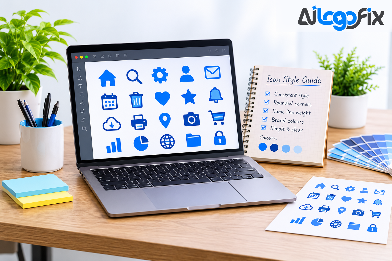
Generating one good icon with AI is easy. Generating thirty icons that look like they belong together is the hard part — and it is the part most people get wrong. Each image is generated separately, so line weight drifts, proportions change, corners round off in one icon and stay sharp in the next, and the finished set looks like a pile of pictures from different designers rather than one system.
The fix is not a better generator. It is a workflow: one style definition, one anchor icon, one reference that every later icon follows, and a hand cleanup at the end. Follow these steps and an AI-generated set can come close to a hand-built one — close enough to ship on a real website.
Why AI icon sets drift
An AI image generator has no memory between prompts unless you give it one. Every generation is independent, so the model reinterprets your style description slightly differently each time. Small rewording between prompts is the main cause of drift — "flat icon, thick outline" in one prompt and "flat vector icon with a bold outline" in the next produce two different line weights.
The second cause is subject difficulty: a simple magnifying glass is easy for the model, a dashboard with charts is not. The model simplifies hard subjects and over-details easy ones, so the set ends up uneven — some icons busy, some empty.
Both problems have the same cure: separate style from subject. The style lives in a block of text you never change. Only the subject changes. The model then gets the same instructions for line, colour, background, and composition every single time.
Step 1: List the icons you need
Before generating anything, write the full list. Group the icons by where they will be used — navigation, features, social, actions — and count them. A typical website starter set is twenty to thirty icons; an app can need fifty or more.
Listing first stops you generating icons you never use, and it shows you the hardest subjects early — the complex icons that test whether your style works. Better to find out on icon one than on icon twenty-nine.
Step 2: Write one style sentence and never change it
An icon prompt needs five parts: the subject, the style, the colours, the background, and the constraints. The trick is to lock four of them into a single style sentence and paste it unchanged into every prompt, changing only the subject.
A good style sentence looks like this: "flat duotone style, rounded corners, uniform thick outline, orange and navy, plain white background, no text". Or, in a fuller style-block form: "flat vector, two or three named colours, white background, centred composition, absolutely no text, no words, no letters, no numbers, no labels anywhere."
Write the style sentence in a text file and paste it — never retype it. Retyping introduces small wording changes, and small wording changes are exactly what causes drift. Use your brand's actual colours, ideally as hex values, so the set matches the rest of the site. And keep the constraints strict: no text, no shadows, no gradients, lots of padding. Text inside an AI icon is almost always garbled, and shadows and gradients break the flat look.
Step 3: Generate the anchor icon first
Pick the most important icon in the set — usually the one that appears most often, such as the primary navigation icon — and generate it first. This becomes your visual anchor: the icon every other icon in the set will be measured against.
Generate the anchor with your full style sentence, then judge it honestly: line weight, corners, detail level at the smallest size it will be used at. If it is not right, regenerate until it is. Do not move on with a mediocre anchor — every later icon inherits its flaws.
A useful test: generate the hardest subject first. If the style works for the hardest icon, it will work for the easy ones. If it fails there, adjust the style sentence now, while only one icon exists.
Step 4: Use the anchor as the reference for every icon
This is the single most important step for consistency. Once the anchor looks right, use it as the style reference for every subsequent icon. Dedicated icon tools make this explicit: Iconly, for example, offers a Reference mode and a normalize flag that keep every icon in a set visually consistent, and Noun Studio is built around a reference-led process where every generation begins with a human-created icon that acts as the visual reference.
If your tool has no reference mode, use the describe-back technique instead. After you have two or three good icons, describe them back to the assistant — "thick two-pixel-equivalent outline, circular endpoints, no fills except the accent" — and add that description to your style sentence. The reference icon shows the tool how the style actually works, instead of requiring you to reconstruct it in words.
Keep each prompt focused on the subject, not the style — short, direct prompts work better once the reference is doing the style work. Generate one icon at a time and review each against the reference before moving on; if an icon drifts, fix it now, not at the end.
Step 5: Generate in batches and review against the anchor
Generate related icons in batches of about five. Icons generated together tend to share a look, and reviewing five at once makes drift easy to spot: lay them next to the anchor and check line weight, corner treatment, proportions, and visual density. If one icon in the batch is off, regenerate that one alone with the anchor as reference.
After each batch, do a visual review before continuing. Do not generate all fifty icons and review at the end — by then the drift has compounded and the fixes take longer than the generation did. Five at a time, check, continue.
Step 6: Clean up the set by hand
AI can come close to a consistent set, but it cannot guarantee one. Ten minutes of cleanup makes a set look professional; skipping it is the difference between a set and a pile of pictures.
Open the chosen icons in a vector editor and do the following:
- Align everything to the same grid, with equal padding on all sides. Uneven padding is the most visible inconsistency in a finished set.
- Equalise stroke weights. Even with a locked style sentence, some icons will come back with slightly thicker or thinner lines. Set them all to one value.
- Fix the corners. Make every corner the same radius, and every line cap and join the same style — round with round, sharp with sharp.
- Use currentColor only, never hardcoded colours, so the icons inherit colour from CSS and can be recoloured anywhere on the site.
- Give every icon the identical viewBox, stroke width, linecap, and linejoin. Even small inconsistencies — a slightly different stroke width, a rounded corner where others are sharp — make the set look amateur.
If an icon came back as a raster image rather than a vector, it needs to be rebuilt as one. AiLogoFix's raster to vector service hand-redraws artwork as clean, closed vector paths in AI, EPS, SVG, and PDF from $10 — the kind of clean SVG an icon set should be built from. And if the icons need to match an existing logo, the logo design service creates original logos from $30, plus custom offers, with the full vector package that a matching icon set should be derived from.
Step 7: Export and ship the set
Export every icon as an SVG with the same viewBox and the same stroke settings. Keep the file names consistent — one naming pattern for the whole set, grouped by the areas you listed in step one. Store the style sentence alongside the files, so the next person who adds an icon uses the same rules.
For deployment, a single SVG sprite, an icon font, or a CDN-hosted set all work; the choice depends on the site. What matters is that every icon ships from the same source, in the same format, with the same settings. And keep the anchor icon in the set's documentation — it is the reference the next generation should be measured against.
What AI cannot do
Perfect consistency is difficult because each image is generated separately, so expect to adjust alignment and line weight by hand. AI also struggles with very complex icons, tiny details that must stay legible at 16 pixels, and icons that must match an existing hand-drawn style exactly. For a logo, a favicon, or brand-critical icons, a human designer still produces the cleaner result — the AI set is a starting point, not the finish.
Also check the licence. Whether AI-generated icons can be used commercially depends on the tool's terms, and they differ between providers. Read the terms of the tool you use before shipping icons on a client project or a commercial site.
FAQ
How many icons should a starter set have?
Twenty to thirty covers a typical website: navigation, main features, actions, and social links. Start with the icons the site actually uses, grouped by area, and add more from the same style sentence as the site grows.
Which AI tool is best for icon sets?
The tool matters less than the workflow. Any generator works if you lock one style sentence, generate an anchor icon first, and use it as the reference for every later icon. Dedicated icon tools such as Iconly and Noun Studio help because reference mode is built in, rather than something you have to work around.
Can AI icons be used commercially?
It depends on the tool. Licences differ between providers, and some free tiers restrict commercial use. Check the terms of the specific tool you used before putting AI-generated icons on a commercial website or a client project.
Why do my AI icons look different from each other?
Because each generation is independent, and small wording changes between prompts change the result. The fix: one style sentence pasted unchanged into every prompt, one anchor icon as the reference, and a hand cleanup to equalise stroke weight, corners, and padding.
Should icons be SVG or PNG?
SVG. Icons need to scale from a 16-pixel favicon to a large feature illustration without losing sharpness, and SVG does that from a single file. PNG is only a fallback for places that cannot display vectors. For more on why SVG wins for icons and logos, see Understanding SVG: The Complete Guide for Designers & Developers.
Conclusion
A consistent AI icon set is not a prompt trick. It is a workflow: list the icons first, write one style sentence and never change it, generate the anchor icon before anything else, use that anchor as the reference for every icon after it, review in batches of five, and clean up stroke weight, corners, and padding by hand. Skip any of those steps and the set drifts; follow them and thirty separately generated icons can look like they were drawn by one designer on one afternoon.
Icons that look like they belong together — and like your brand.
Your website deserves an icon set that looks designed, not assembled from random images. AiLogoFix's specialist team creates clean, consistent vector icon sets and logos — one style, one palette, one set of rules — so every icon on your site looks like it came from the same hand. Every order includes refinements within your selected package and agreed brief, and full commercial rights.
Already have icons that do not match? Message the team — send them over and we will tell you the cleanest way to rebuild them as one set, for free.