
Brochure Folds Explained: Bi-Fold, Tri-Fold and Z-Fold Layout Setup
The fold is what makes a brochure a brochure — and it’s where most DIY brochures fail. Panels must be the right widths, folds must fall in the right places, and content must respect the fold lines. Here’s how the three standard brochure folds work and how to set each one up for print.
In This Guide
- Bi-Fold: The Simple Classic
- Tri-Fold: The Workhorse
- Z-Fold: The Accordion
- Brochure Folds Compared
- Universal Setup Rules for All Brochure Folds
- FAQs
- Brochure Folds FAQ: 8 Questions Answered
- 7 Brochure Folds Mistakes (and How to Fix Each)
- Designing for Each Fold Type
- Brochure Folds Preflight Checklist
- Pro Tips for Brochures That Get Read
- When to Hire a Designer for Brochure Folds
- Brochure Folds for Different Industries
- Brochure Folds Glossary
Quick answer: Bi-fold = 4 panels (fold in half). Tri-fold = 6 panels (inside flap ~2mm narrower). Z-fold = 6 equal panels in a zigzag. Set up at flat size + 3mm bleed, mark fold lines as guides, keep text 5mm from folds and trim.
Bi-Fold: The Simple Classic
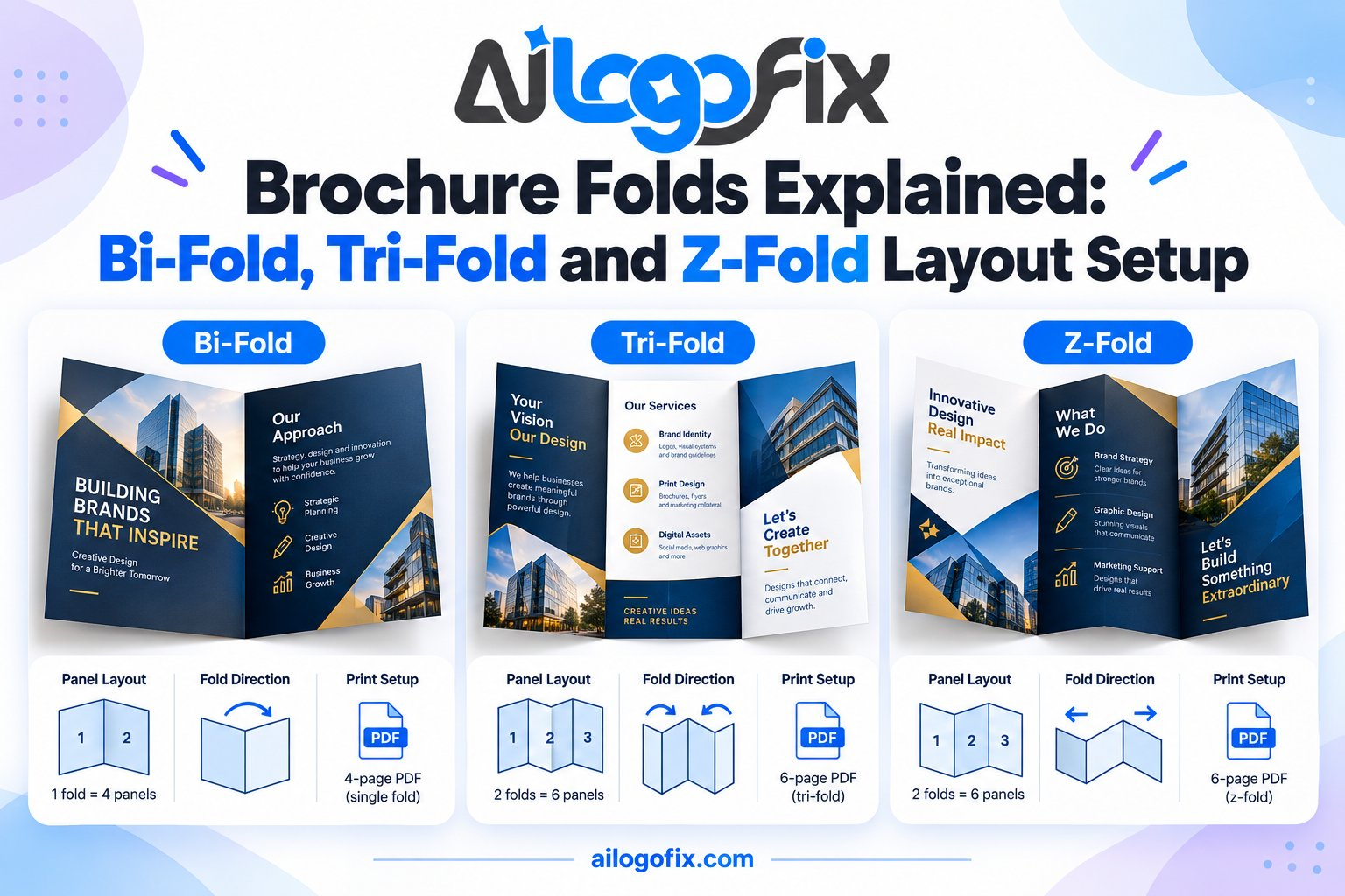
Structure: One fold down the middle creates 4 panels — front cover, back cover, and two inside panels.
Setup: Flat size is double the finished size (A4 flat → A5 finished). Both halves are equal width. The simplest of the brochure folds to design for: treat it as two pages side by side.
Best for: Programs, premium product sheets, invitations, menus. When you want a booklet feel without binding.
Watch out for: The fold itself — avoid placing critical text or faces directly on the center fold, where it disappears into the crease.
Tri-Fold: The Workhorse
Structure: Two folds create 6 panels — the most common of all brochure folds.
Setup — the critical detail: The inside flap panel (the one that folds in) must be approximately 2mm narrower than the other two panels. Without this, the folded brochure buckles and won’t lie flat. For an A4 flat tri-fold: panels of roughly 99mm / 99mm / 97mm (confirm exact specs with your printer).
Panel roles: front cover → inside spread (3 panels tell the story) → back cover (contact, map, CTA) → fold-in flap (teaser or signup).
Best for: General marketing, tourism, real estate, services — anywhere you need to tell a compact story.
Z-Fold: The Accordion
Structure: Two folds in opposite directions create 6 equal-width panels that open like an accordion.
Setup: Unlike the tri-fold, all panels are the same width — simpler math. The zigzag means each panel is revealed in sequence, which suits step-by-step content.
Best for: Instructions, timelines, processes, multi-language content (one language per section).
Watch out for: Panel order when flat vs folded — map it on paper first. It’s easy to design panels in the wrong sequence.
Brochure Folds Compared
| Bi-Fold | Tri-Fold | Z-Fold | |
|---|---|---|---|
| Panels | 4 | 6 | 6 |
| Panel widths | Equal | Inside flap ~2mm narrower | All equal |
| Complexity | Low | Medium | Medium |
| Best for | Premium, simple | General marketing | Sequential content |
Universal Setup Rules for All Brochure Folds
Flat size + bleed: Design at the unfolded flat size plus 3mm bleed on outer edges.
Fold guides: Mark every fold line with a guide. Never place text within 5mm of a fold.
Paper matters: Heavier stock needs wider fold allowances (the paper’s thickness eats space at the fold). Ask your printer about “creep” compensation for thick brochures.
Test fold: Print at 100% on office paper, cut, and fold it. Five minutes with scissors catches errors no screen can show.
Working from an AI mockup? See AI-generated brochure to production-ready.
FAQs
Which brochure fold should I choose?
Tri-fold for general marketing, bi-fold for premium/simplicity, Z-fold for step-by-step or sequential content.
Why is one tri-fold panel narrower?
The inside flap folds into the brochure, so it needs ~2mm less width to nest flat without buckling.
Can text cross a fold line?
Avoid it. Ink cracks on folds and the crease swallows content. Keep text 5mm+ from every fold.
What paper weight for brochures?
150–250gsm is typical. Heavier stock feels premium but needs fold scoring — discuss with your printer.
How do I set up folds in my design software?
Draw guide lines at the fold positions on your flat-size document. Most designers also add a non-printing “fold marks” layer for reference.
Should I score the folds?
For stock over ~170gsm, yes — scoring prevents cracking along the fold. Your printer handles this; just ask.
The bottom line: Brochure folds are geometry, not guesswork. Get the panel widths right, respect the fold lines, test-fold a paper mockup — and the finished piece will open exactly as designed.
Brochure Folds FAQ: 8 Questions Answered
Everything about brochure folds, from panel math to paper choice.
What are the most common brochure folds?
Tri-fold, bi-fold, and Z-fold cover 90% of folded brochures in the wild. The tri-fold (letter fold) divides a sheet into three panels with one tucked inside. The bi-fold is a single fold making four panels. The Z-fold zigzags like an accordion. Each of these formats suits different content: tri-folds for general marketing, bi-folds for premium presentations, Z-folds for step-by-step content. Choose the fold before designing, because panel sizes drive the entire layout.
How do panel sizes work in brochure folds?
Panels are not equal. In a tri-fold, the inside flap must be slightly narrower (typically 2-3mm) so it tucks cleanly inside the other panels. This is the most misunderstood detail in fold design. For a US Letter tri-fold, panels measure roughly 95mm, 100mm, and 100mm rather than three equal thirds. Z-fold panels can be equal since nothing tucks. Always build on a proper template with exact panel measurements rather than dividing by eye.
What paper weight works for brochure folds?
150-250gsm covers most folded brochures. Lightweight 130-170gsm suits high-volume handouts; 200-250gsm gives premium feel for sales brochures. Heavy stock (300gsm+) cracks along folds unless scored. The fold type matters too: complex folds like gate folds work better on lighter stock, while simple bi-folds handle heavy board beautifully. Always score before folding anything over 200gsm.
What is scoring, and when do brochure folds need it?
Scoring creases the paper before folding, preventing cracks in the ink and fibers. All professional folds on stock over 170gsm should be scored. Without scoring, dark ink cracks along the fold line showing ugly white fibers. Your printer scores during finishing, but you must design with fold positions exact. Mark fold lines clearly in your brochure folds file and confirm them against the printer’s template.
How much bleed do brochure folds need?
Standard 3mm on all outer edges, just like other print work. But folded pieces have a second consideration: keep critical content away from fold lines by 5-10mm. Text crossing a fold becomes hard to read and looks sloppy. Backgrounds should flow continuously across folds for a seamless look. When planning the layout, treat each panel as its own canvas but design backgrounds as one continuous image.
Should brochure files be CMYK?
Yes, without exception. Design all folded brochures in CMYK from the start. Brochures often include photography, and RGB-to-CMYK shifts are most visible in skin tones and brand colors. Convert photos deliberately in Photoshop with proper rendering intent. If your brochure folds include brand-critical colors, specify Pantone references so the printer can match them.
Can I use the same design for different brochure folds?
No, each fold needs its own layout. A tri-fold design cannot become a Z-fold by renaming the file. Panel sizes, fold positions, reading order, and content flow all differ between fold types. The back panel of a tri-fold becomes the cover; in a Z-fold every panel can be a cover. Rebuilding the layout per format is real design work, not a file conversion.
How do I set up the reading order?
Think about how hands unfold the piece. For tri-folds: back panel (cover), inside spread (three panels revealed), then the tucked flap last. Good fold design choreographs this reveal deliberately. The cover earns attention, the spread delivers the message, the flap closes the sale. Map your reading order on paper before touching layout software.
7 Brochure Folds Mistakes (and How to Fix Each)
1. Equal panels on a tri-fold. The tuck flap binds and buckles. Fix: make the inside flap 2-3mm narrower in your template. This tiny difference is the mark of professional work.
2. Text across fold lines. Words break mid-sentence at the crease. Fix: keep all text 5-10mm clear of every fold line.
3. Wrong reading order. The story starts on a hidden panel. Fix: mock up the brochure folds physically and number the panels in reading sequence before designing.
4. Unscored heavy stock. Ink cracks reveal white paper fibers along folds. Fix: specify scoring for any folds on stock over 170gsm, and design fold positions precisely.

5. Low-resolution images. Brochures are held close, so flaws show. Fix: 300 DPI effective on every image in your file, and vector logos only.
6. Ignoring the back panel. The tri-fold back becomes the cover; leaving it blank wastes prime space. Fix: design the cover panel as carefully as any other.
7. RGB color surprises. Converted colors disappoint on press. Fix: build everything in CMYK and soft-proof before export.
The brochure format has a long history, closely related to the pamphlet tradition of folded printed matter.
Designing for Each Fold Type
How brochure folds strategy changes per format.
Bi-fold. Four generous panels suit premium content: portfolios, menus, invitations. The large panels in these brochure folds welcome big photography and generous white space. Cover, inside spread, back: a simple, elegant sequence.
Tri-fold. Six compact panels for information-dense marketing. The classic brochure folds workhorse: cover hooks, inside spread informs, flap converts. Keep each panel focused on one idea; cramming kills readability.
Z-fold. Six panels that unfold into one long strip. Perfect for timelines, processes, and comparisons. These brochure folds let readers scan the whole story at a glance once fully opened.
Gate fold. Two flaps meet in the middle like doors, revealing a large center spread. Dramatic brochure folds for launches and announcements. The reveal moment is the entire point, so design the center spread as a showpiece.
Accordion fold. Multiple Z panels for long content: maps, instructions, product ranges. These brochure folds need consistent panel rhythm; varying widths confuse the fold pattern.
Brochure Folds Preflight Checklist
- Fold type chosen before layout begins, with correct template
- Tri-fold inside flap set 2-3mm narrower than other panels
- 3mm bleed on all outer edges; backgrounds flow across folds
- All text 5-10mm clear of fold lines
- Reading order mapped and numbered on a physical mockup
- Images 300 DPI effective; logos are vector format
- CMYK color mode throughout; brand colors specified
- Scoring specified for stock over 170gsm
- Fonts embedded or converted to outlines
- Exported PDF/X with correct panel dimensions and fold marks
Pro Tips for Brochures That Get Read
Mock up physically first. Fold a blank sheet and label the panels. Every professional plans folded layouts on paper before opening design software. This ten-minute step prevents most layout disasters.
One idea per panel. Tri-fold panels are small; cramming three messages into one guarantees none land. Disciplined brochure folds design gives each panel a single job.
Design the reveal. The unfolding sequence is a storytelling tool. Tease on the cover, build inside, convert on the flap. Great brochure folds choreograph attention.
Continuous backgrounds. Let images and colors flow across fold lines for a seamless premium feel. Broken backgrounds make brochure folds look pieced together.
End with action. The final panel readers see should carry the call to action: call, scan, visit. Never let your brochure folds fizzle out on a blank flap.
Print a proof copy. Before approving a full run, request a folded proof on the actual stock. Screen previews cannot show how folds feel, how the paper handles, or whether panels align. A physical proof of your folded brochure costs little and catches expensive mistakes while they are still cheap to fix.
When to Hire a Designer for Brochure Folds
Simple layouts are DIY-able, but brochure folds expertise pays when quality matters.
Your logo is not print-ready. Pixelated logos ruin premium brochures. Designers start with vector artwork; convert yours to vector before building brochure folds layouts.
Complex folds intimidate you. Gate folds, die cuts, and multi-panel accordions have technical demands beyond templates. Professional brochure folds design handles the engineering.
The printer keeps rejecting files. Fold marks, panel math, and imposition confuse beginners. A designer fluent in brochure folds prepress eliminates rejections.
Need brochures that impress? Message our design team for print-ready brochure folds files that fold perfectly the first time.
Brochure Folds for Different Industries
Different businesses get more from different brochure folds. Match the format to the message.
Real estate. Bi-folds showcase properties with large photography and room for floor plans. The premium feel of a heavy-stock bi-fold matches high-value listings. Agents often add a pocket inside the back panel for business cards and flyers. For property marketing, these brochure folds signal quality before a word is read.
Restaurants and hospitality. Tri-folds work brilliantly as takeaway menus: compact in the pocket, comprehensive when opened. Laminate them for wipeable durability. Hotels use Z-folds for area guides that guests can scan quickly. The right brochure folds choice here balances portability with appetite appeal.
Healthcare. Tri-folds organize complex information into digestible panels: symptoms, treatments, aftercare. Clear headings per panel help anxious readers find answers fast. Use calming colors and generous white space. Accuracy matters more than flair, so proofread medical content with extra care.
Events and conferences. Accordion folds handle schedules beautifully, with each panel covering a time block or venue area. Attendees unfold as the day progresses. Gate folds create dramatic invitations for galas and launches. Print on sturdy stock since event pieces get handled roughly.
Retail and product. Z-folds lay product ranges side by side for easy comparison. Die-cut bi-folds shaped like products create memorable leave-behinds. Include pricing carefully: if prices change often, leave a panel for a sticker or QR code linking to live pricing.
Nonprofits. Tri-folds tell the story efficiently: the problem, your work, how to help. Emotional photography on the cover, impact statistics inside, donation details on the flap. Cost-effective brochure folds on quality uncoated stock stretch tight budgets while looking professional.
Education. Schools and courses use tri-folds for program overviews: curriculum, faculty, admissions steps. Parents compare options side by side, so clarity beats decoration. Include key dates prominently and keep contact information impossible to miss.
Brochure Folds Glossary
Panel: A single face of the folded sheet; the basic unit of brochure folds design.
Score: A crease pressed before folding to prevent cracking.
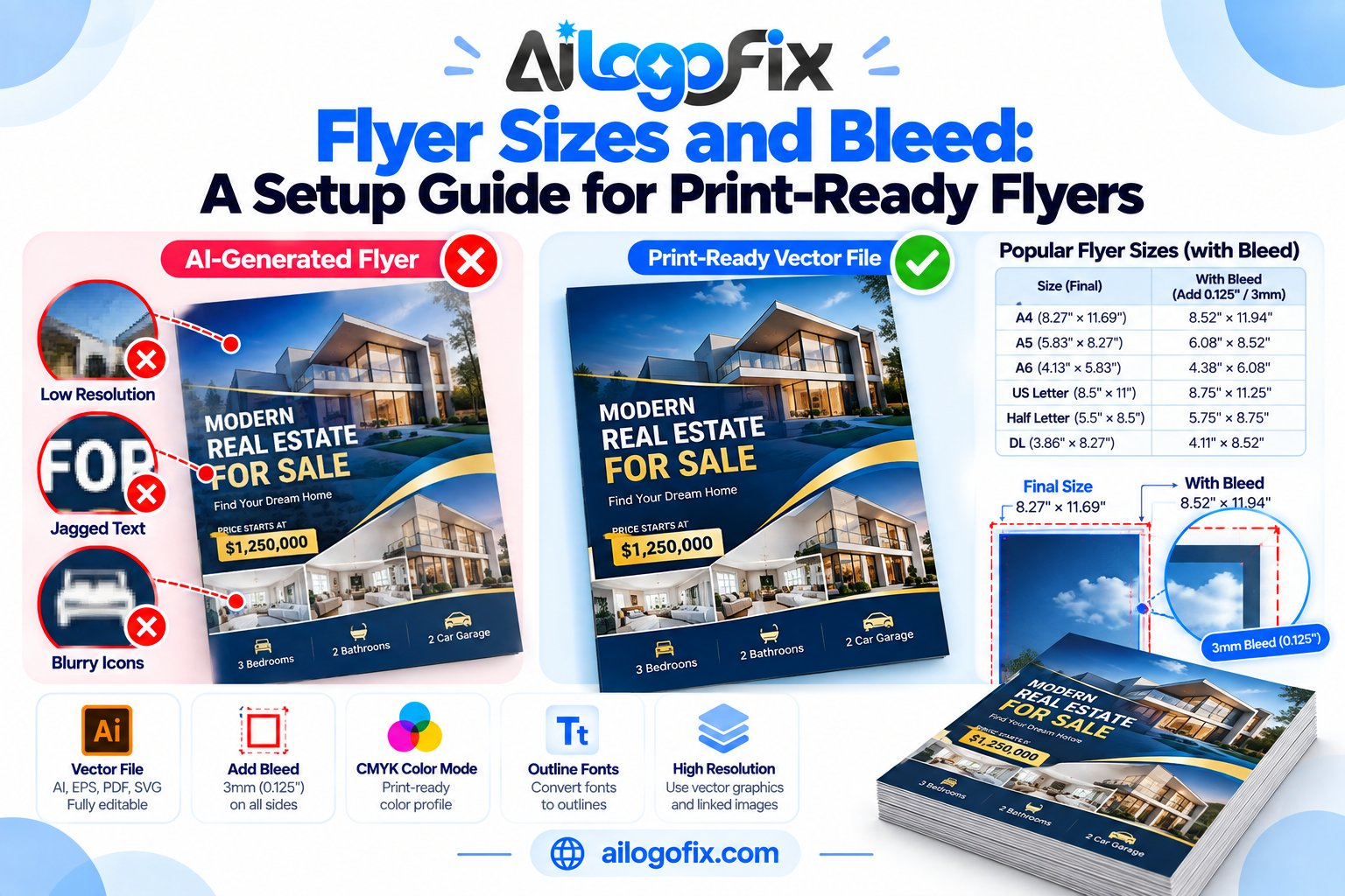
Bleed: 3mm printed margin trimmed from outer edges.
Tuck flap: The narrower inner panel of a tri-fold.
Imposition: Arranging pages on the press sheet for correct folding.
Gate fold: Two flaps meeting at center, opening like doors.
Accordion fold: Zigzag folding creating multiple parallel panels.
Self-cover: Brochure printed on a single stock with no separate cover.
Plus cover: Heavier separate cover stock wrapped around text pages.
Creep: Inner pages shifting outward in thick folded pieces.
Keep a flat PDF archived. Save an unfolded, layered version of your brochure file alongside the print PDF. When you need to update prices or dates next quarter, you will edit in minutes instead of rebuilding from scratch.
Bottom line: Great brochure folds start with the right template, respect panel math, and choreograph the reader’s unfolding journey.
Quick reference: The most common brochure folds are bi-fold (4 panels), tri-fold (6 panels), and z-fold (6 panels). Each brochure folds layout needs 3mm bleed, careful panel sizing to accommodate fold creep, and text kept clear of fold lines. Test with a paper mockup before finalizing.