
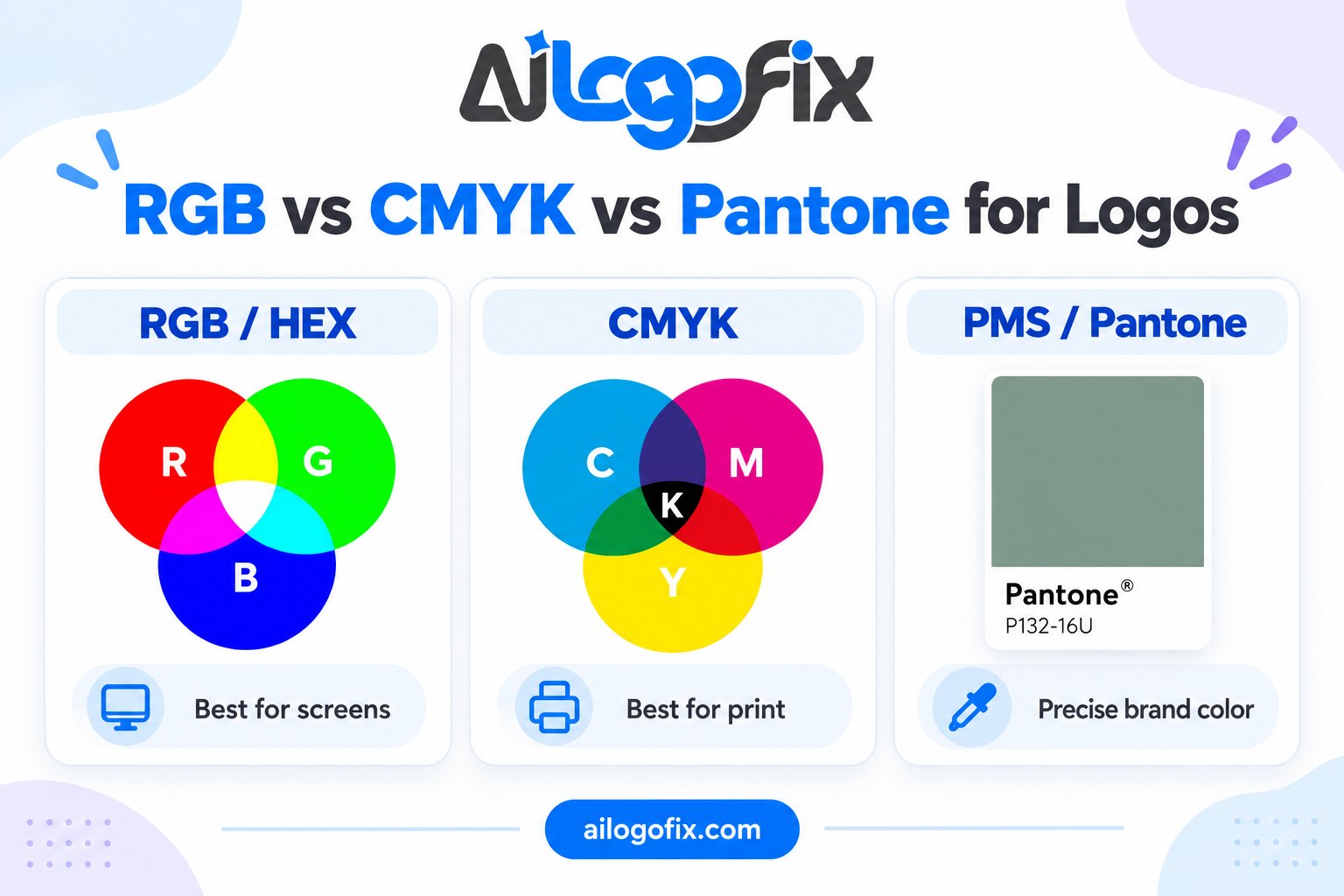
RGB vs CMYK vs Pantone for Logos: Which Color Mode Does Your Logo Need?
Your logo looks perfect on screen — then it comes back from the printer dull, dark, or just plain wrong. Nine times out of ten, the culprit is color mode.
In This Guide
- RGB: Color for Screens
- CMYK: Color for Standard Printing
- Pantone: Exact Color, Every Time
- RGB vs CMYK vs Pantone: Side by Side
- The Conversion Trap (and How to Avoid It)
- What This Means for Your Logo Files
- FAQs
- RGB vs CMYK: Complete FAQ
- 7 RGB vs CMYK Mistakes and How to Fix Each
- Pro Tips for Perfect RGB vs CMYK Color
- When to Hire a Designer for RGB vs CMYK Work
- RGB vs CMYK Glossary
RGB vs CMYK vs Pantone is the most misunderstood topic in logo design, and getting it wrong costs real money in reprints. Here is the plain-English guide: what each mode is, when to use it, and how to set up your logo files correctly.
Quick answer: Use RGB for screens (websites, social media), CMYK for standard printing (business cards, flyers), and Pantone spot colors when you need exact, repeatable brand color (packaging, signage, large runs). A professional logo package includes all three.
RGB: Color for Screens
RGB (Red, Green, Blue) is how screens make color — mixing light. Every website, app, phone screen, and social platform uses RGB. It can produce bright, vivid colors that print simply cannot reproduce — neon greens, electric blues, glowing oranges.
Use RGB for: your website logo (SVG/PNG), social media avatars, presentations, email signatures, anything viewed on a screen.
The trap: designing your logo in RGB and sending that file to a printer. The printer converts it to CMYK as best it can — and those vivid screen colors turn muddy. This is the number-one cause of “the print doesn’t match my screen.”
CMYK: Color for Standard Printing
CMYK (Cyan, Magenta, Yellow, Key/Black) is how standard printers make color — mixing ink on paper. Business cards, flyers, brochures, letterheads, and most packaging print in CMYK.
Use CMYK for: anything going to a commercial or office printer. Your print-ready logo PDF should be built in CMYK with colors defined as CMYK values.
The trade-off: CMYK’s color range (gamut) is smaller than RGB’s. Some bright screen colors have no CMYK equivalent. A good designer picks brand colors that survive the conversion — or warns you when they will not.
Pantone: Exact Color, Every Time
Pantone (PMS — Pantone Matching System) is a library of standardized spot colors. Instead of mixing CMYK inks and hoping, the printer uses a pre-mixed Pantone ink — so your brand red is the exact same red on every business card, sign, and package, from every printer, forever.
Use Pantone for: brand-critical color consistency — packaging, signage, vehicle wraps, uniforms, large print runs, and any two-color job (a Pantone spot color plus black is cheaper than full CMYK).
The trade-off: cost. Spot-color printing adds expense, so it is reserved for work where exact color is worth paying for.
RGB vs CMYK vs Pantone: Side by Side
| RGB | CMYK | Pantone | |
|---|---|---|---|
| What it is | Light on screens | Ink for standard print | Pre-mixed spot ink |
| Use for | Web, social, presentations | Cards, flyers, brochures | Packaging, signage, brand-critical print |
| Color range | Widest, most vivid | Narrower, duller brights | Exact, repeatable |
| File formats | SVG, PNG, JPG | Print PDF | Print PDF with spot plates |
| Cost | Free | Standard | Premium |
The Conversion Trap (and How to Avoid It)
Here is where logos get ruined: a logo designed only in RGB gets converted to CMYK at print time, and the colors shift. The designer’s screen showed one thing; the printed piece shows another.
How professionals handle it:
1. Define brand colors in all modes from day one. Your logo package should list each brand color as HEX/RGB (screen), CMYK (print), and Pantone (spot) values. No guessing later.
2. Design with the end use in mind. If the logo will live mostly in print, choose colors inside the CMYK gamut. If it is digital-first, RGB freedom is fine — but still define the CMYK fallback.
3. Never let the printer “auto-convert.” A print-ready file is built in CMYK by the designer, who adjusts anything that shifts. Auto-conversion by the print shop is a gamble.
4. Proof it. For critical work, get a printed proof before the full run. Screens lie; paper tells the truth.
What This Means for Your Logo Files
Your complete logo package needs color-correct versions for each world: RGB files for screen (SVG, PNG), a CMYK print PDF for standard printing, and Pantone definitions for spot-color work. If your “logo files” are a single RGB JPG, you are set up for exactly the disappointment this article describes.
See the full checklist: what files you should receive with a professional logo. And if your current logo only exists as a screen file, we can rebuild it properly: raster to vector service.
Logo Files Built Right for Print and Screen
Our designers rebuild your logo as a true vector master with correct RGB, CMYK, and Pantone color definitions — so it looks right everywhere, from your website to the print shop.
FAQs
Should my logo be RGB or CMYK?
Both — RGB versions for screens, CMYK versions for print. They are different files for different jobs, built from the same vector master.
Why do my printed colors look different from my screen?
Your screen shows RGB (light); the printer uses CMYK (ink). Some RGB colors cannot be reproduced in CMYK, so they shift. Designing in CMYK from the start — or defining proper CMYK values — prevents the surprise.
What is a Pantone color in simple terms?
A standardized, pre-mixed ink color with a number (like Pantone 185 C). Any printer in the world can mix that exact color, so your brand stays consistent everywhere.
Do I need Pantone colors for my logo?
Not always. Small businesses usually do fine with well-defined CMYK and RGB values. Pantone becomes worth it when exact color consistency matters — packaging, signage, franchises, large runs.
Can you convert my RGB logo to CMYK?
Yes, but it must be done by a designer who checks and adjusts the shifted colors — not by an automatic conversion. The vector master makes this straightforward.
How do I know which color mode a file uses?
Open it in a design program and check the document color mode, or ask your designer. A print-ready PDF should be CMYK; web files (PNG, SVG, JPG) should be RGB.
The bottom line: RGB for screens, CMYK for print, Pantone for exact brand color. Define all three when the logo is made, and you will never pay for a reprint caused by a color-mode surprise.
RGB vs CMYK: Complete FAQ
Everything designers ask about RGB vs CMYK for logos, answered in plain language. Whether you design for screens, print, or both, these RGB vs CMYK answers will save you from dull prints and neon surprises.
What is the difference between RGB and CMYK?
RGB builds color from light. Your screen mixes red, green, and blue light to create every color you see, which is why RGB vs CMYK starts with understanding additive versus subtractive color. CMYK builds color from ink: cyan, magenta, yellow, and black ink absorb light on paper. Because screens emit light and paper reflects it, the two systems produce different color ranges. RGB can show bright neons that CMYK ink simply cannot reproduce. This is the core reason RGB vs CMYK matters for logos: a logo designed in RGB will shift, often dulling noticeably, when converted for print.
Which color mode should I use for my logo?
Use both, but start in the right one. For RGB vs CMYK logo workflow, design the master logo in a wide-gamut space, then export an RGB version for screens and a CMYK version for print. If your logo will mostly live online (website, social media, apps), RGB is your primary mode. If it will be printed (business cards, packaging, signage), you need a proper CMYK build. The professional approach to RGB vs CMYK is maintaining two approved logo files rather than converting on the fly. Never let a printer auto-convert your RGB logo; the color shift is unpredictable and always disappointing.
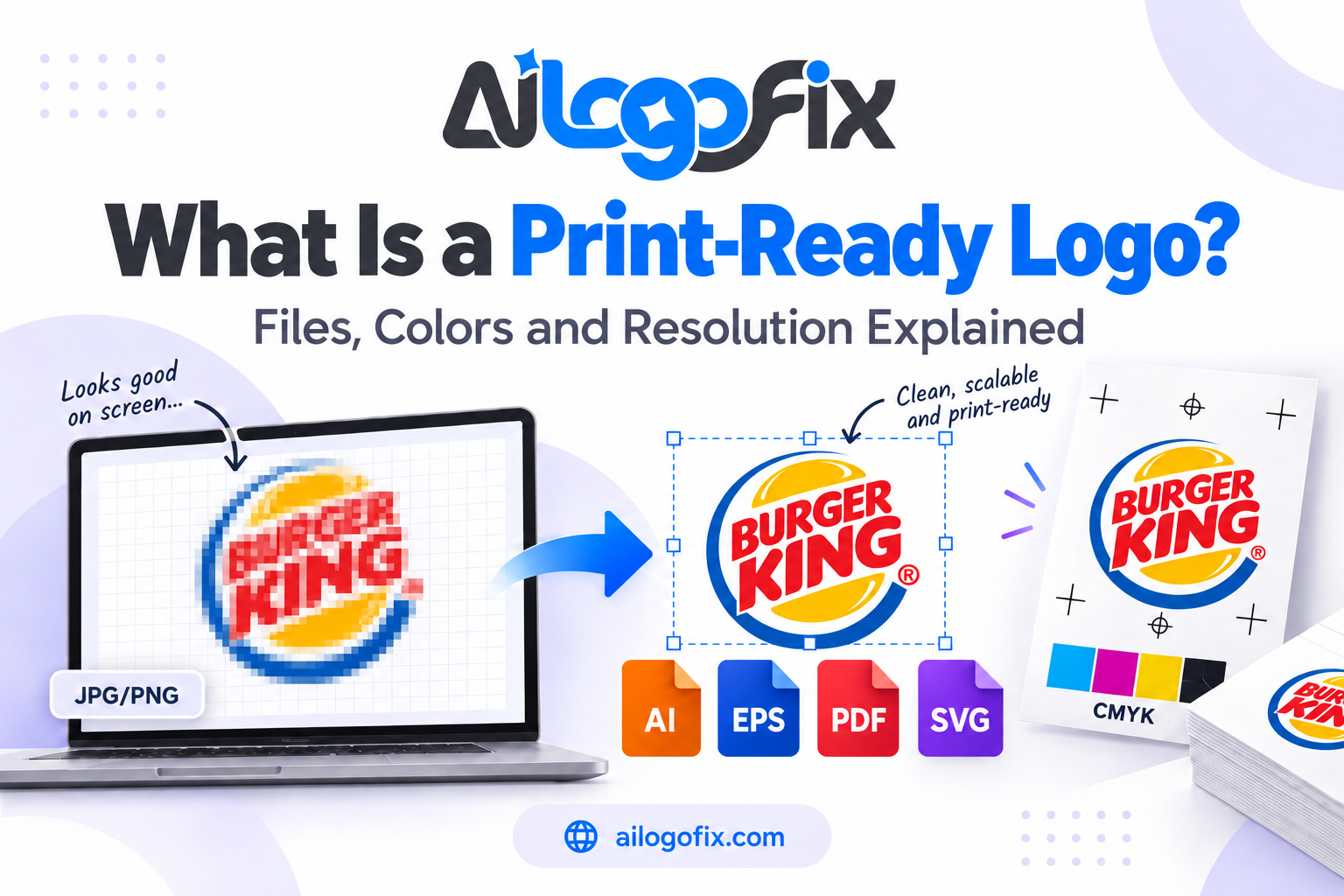
Why do my printed colors look dull compared to my screen?
Your screen shows RGB; your printer speaks CMYK. The RGB vs CMYK gamut gap means vibrant screen colors, especially bright blues, greens, and oranges, fall outside what CMYK ink can reproduce. When conversion happens, those colors get pulled toward the nearest printable equivalent, which looks duller. The fix for this RGB vs CMYK problem is designing in CMYK from the start for print work, or soft-proofing with your printer’s ICC profile. Always request a printed proof for color-critical jobs; screens lie, but a proof tells the truth about your RGB vs CMYK conversion.
What is Pantone and where does it fit in RGB vs CMYK?
Pantone is a standardized spot-color system: premixed inks with numbered references that print identically anywhere in the world. In RGB vs CMYK discussions, Pantone is the third option for brand-critical colors. While CMYK mixes four inks on press (with slight variation between print runs), a Pantone spot color is one premixed ink, giving perfect consistency. For logos, many brands specify a Pantone reference as the master color, then provide RGB vs CMYK equivalents for digital and process printing. Use Pantone when color consistency across vendors matters more than cost.
Can I convert RGB to CMYK without color shift?
Not perfectly, but you can control it. Every RGB vs CMYK conversion remaps out-of-gamut colors to printable ones, and some shift is unavoidable. The trick is converting deliberately rather than accidentally. Convert in Photoshop or Illustrator where you choose the rendering intent (perceptual usually looks most natural for logos) instead of letting an export dialog do it blindly. After any RGB vs CMYK conversion, compare against the original and manually adjust critical brand colors. Then lock the CMYK version as your approved print file so nobody re-converts later.
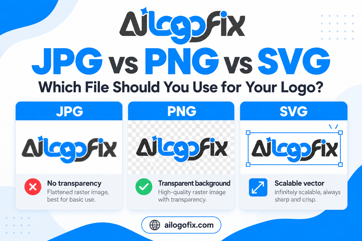
Should my logo files be RGB or CMYK for a website?
RGB, always. Websites, apps, and social media all display in RGB, so sRGB is the correct export for anything on screen. Uploading a CMYK image to a website causes browsers to display it incorrectly, often with a strange color cast. Export web logos as sRGB PNG or SVG for crisp display. Keep your RGB vs CMYK discipline clean: RGB files for digital use, CMYK files for print, and never mix them. Name files clearly (logo-rgb.png, logo-cmyk.pdf) so the right version gets used every time.
How do I set up an RGB vs CMYK workflow in Illustrator?
Set the document color mode before you draw anything. For print logos, choose File, then Document Color Mode, then CMYK Color at creation; for digital-first logos, choose RGB. This RGB vs CMYK decision at setup prevents most conversion pain later. Work with the appropriate color pickers and swatch libraries for your chosen mode. When you need both versions, duplicate the file and convert the copy with the right ICC profile. Save both RGB vs CMYK versions in your brand folder with clear names, and document which file serves which purpose.
7 RGB vs CMYK Mistakes and How to Fix Each
These RGB vs CMYK errors cost real money in reprints. Fix each one with the steps below.
1. Designing everything in RGB, then converting at the last minute. This is the classic RGB vs CMYK disaster: a gorgeous screen logo turns muddy in print because out-of-gamut colors collapse unpredictably. The fix is deciding print versus digital before you start, then setting your document color mode to match. If the logo will ever be printed, design the master in CMYK from the first shape. You can always export a vibrant RGB version later, but rescuing a dull CMYK conversion is painful.
2. Trusting your uncalibrated monitor. Every screen displays RGB vs CMYK color differently, and an uncalibrated monitor lies about both. What looks like a rich navy on your laptop might print as washed-out blue. Fix: calibrate your display with a hardware calibrator, or at minimum use your OS display calibration wizard. Better yet, never approve print color from a screen alone; the RGB vs CMYK truth only appears on a printed proof.
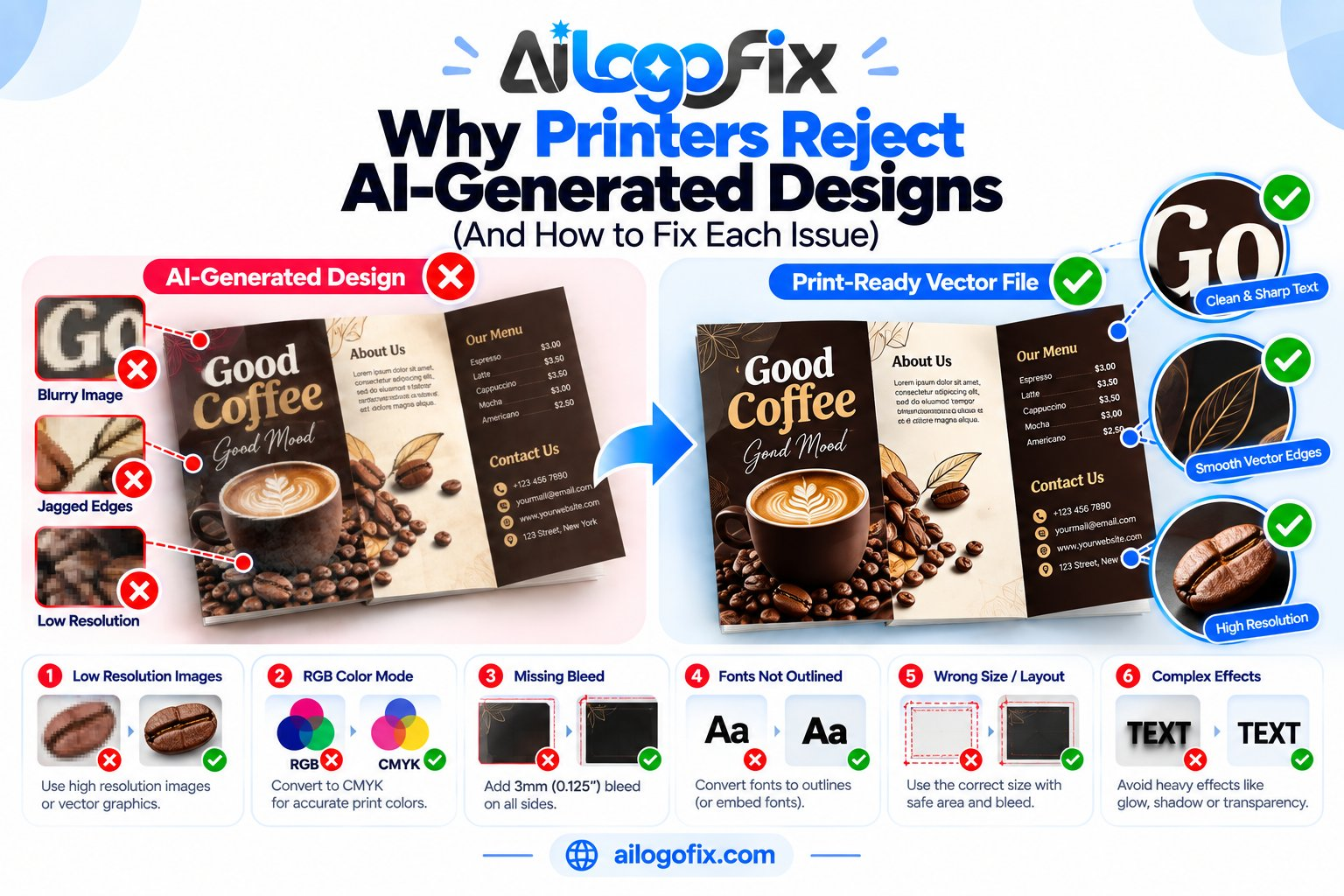
3. Using the wrong black. RGB black (0,0,0) converts to a muddy four-color black in CMYK that can look gray and cause registration blur on text. Meanwhile plain 100K black looks washed out on large areas. The RGB vs CMYK fix: use rich black (for example 60C 40M 40Y 100K) for large solid areas and pure 100K for small text. Specify your black builds in the brand guide so every vendor matches.
4. Forgetting that Pantone and CMYK are different systems. Many designers pick a Pantone swatch on screen, then send a CMYK file and wonder why nothing matches. RGB vs CMYK vs Pantone are three separate color languages. Fix: if the brand color is Pantone reflex blue, either print it as a true spot color or use the official Pantone-to-CMYK bridge values. Never eyeball the conversion; use published bridge guides for your RGB vs CMYK and Pantone workflow.
5. Exporting web graphics in CMYK. A CMYK PNG on a website displays with shifted, often greenish colors because browsers expect RGB. This RGB vs CMYK mix-up is common when designers reuse the print file for digital. Fix: maintain separate exports. Your print PDF stays CMYK; every web asset gets exported fresh as sRGB. Add the color mode to the filename so the mistake becomes impossible.
6. Ignoring the printer’s ICC profile. Generic CMYK conversions assume a standard press, but your printer’s inks, paper, and press all shift color. Skipping their ICC profile is an RGB vs CMYK gamble. Fix: ask the printer for their preferred profile (often a FOGRA or GRACoL standard), install it, and soft-proof your logo with View and Proof Colors before exporting. Ten minutes of proofing beats a thousand misprinted brochures.
The science behind these color systems is well documented: how the CMYK color model works and how the RGB color model works.
Pro Tips for Perfect RGB vs CMYK Color
Go beyond the basics with these professional RGB vs CMYK practices. First, build a brand color sheet showing every logo color as Pantone, CMYK, RGB, and HEX side by side. This single reference ends most RGB vs CMYK confusion because everyone, from web developer to print vendor, reads from the same page. Include the exact builds: for example, brand blue as Pantone 2935 C, CMYK 100/70/0/0, RGB 0/86/179, HEX 0056B3.
Second, design your logo in a device-independent way where possible. Draw shapes and pick colors from a calibrated swatch library rather than eyeballing screen color. When your RGB vs CMYK source colors are defined numerically, conversions stay consistent across software. Save custom swatches in your design app so the exact brand builds are one click away.
Third, proof early and proof on the real stock. Ink behaves differently on coated versus uncoated paper, and no screen simulation captures that fully. For any serious RGB vs CMYK print job, request a hard proof on the actual paper stock before the full run. The cost of one proof is nothing next to a reprint.
Fourth, keep a conversion log. Every time you convert a logo between RGB vs CMYK modes, note the profile, rendering intent, and date in the file metadata or a readme. Six months later, when someone asks why the blue changed, you will have the answer instead of a mystery.
When to Hire a Designer for RGB vs CMYK Work
Color management looks simple until money is on the line. Hire a professional when your RGB vs CMYK stakes are high.
Your brand color keeps printing wrong. If every vendor produces a different blue, your RGB vs CMYK files are inconsistent. A designer rebuilds your logo with locked Pantone, CMYK, RGB, and HEX values so the color matches everywhere, every time.
You are launching packaging or signage. Large-format and packaging printing magnify every RGB vs CMYK error. Professional file setup with correct profiles, rich blacks, and spot colors prevents expensive reprints.
You only have an RGB logo. A proper CMYK conversion needs more than an export dialog; it needs manual color correction by someone who understands the RGB vs CMYK gamut. Our vector conversion service rebuilds logos with print-ready color from the start.
Stop gambling with color. Message our design team and get RGB vs CMYK files done right the first time.
RGB vs CMYK Glossary
Key terms for mastering RGB vs CMYK color:
Gamut: The range of colors a device or color system can reproduce. RGB has a wider gamut than CMYK.
Additive color: Color made by adding light (RGB). More light means brighter color; all light combined makes white.
Subtractive color: Color made by absorbing light with ink (CMYK). More ink means darker color; all inks combined make near-black.
Spot color: Premixed ink printed as a single color, such as Pantone. More consistent than CMYK builds.
Process color: Full-color printing using the four CMYK inks mixed on press.
ICC profile: A data file describing how a specific device reproduces color. Essential for accurate RGB vs CMYK conversion.
Rendering intent: The strategy used when converting out-of-gamut colors (perceptual, relative colorimetric, and others).
Soft proofing: Simulating print output on screen using an ICC profile before printing.
Rich black: A deep black built from all four CMYK inks instead of black ink alone.
sRGB: The standard RGB color space for web and screens.
Bottom line: Master RGB vs CMYK once and you will never pay for a color reprint again. Design in the right mode from the start, keep separate RGB and CMYK master files, specify Pantone references for critical brand colors, and always proof before you print. Color discipline is what separates amateur logos from professional brand systems.