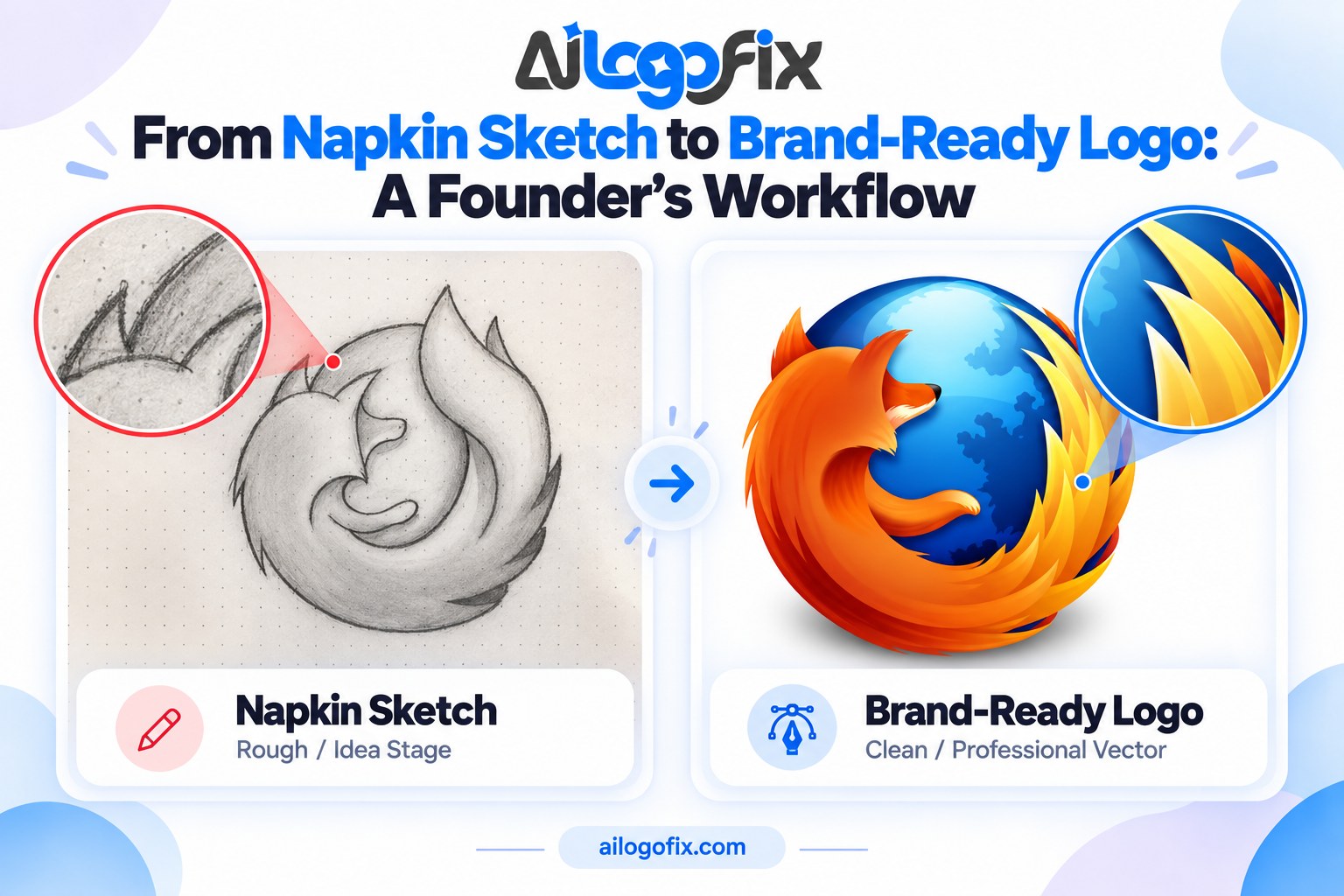
From Napkin Sketch to Brand-Ready Logo: A Founder’s Workflow
Every great logo starts ugly — a ballpoint sketch on a napkin, a whiteboard doodle, a phone photo of a notebook page. The distance between that sketch and a brand-ready logo is a workflow, not a miracle. Here is the complete sketch to logo workflow, step by step.
In This Guide
- Step 1: Capture the Sketch Properly
- Step 2: Clarify the Concept (Before Any Software)
- Step 3: Get a Clean Digital Draft
- Step 4: Professional Vectorization
- Step 5: Build the Complete Package
- Common Founder Mistakes
- FAQs
- Napkin Sketch to Logo: Complete FAQ
- 6 Napkin Sketch to Logo Mistakes and How to Fix Each
- Pro Tips for Founders: Sketch to Brand
- When to Hire a Designer for Your Napkin Sketch
- Founder’s Logo Glossary
Quick answer: Photograph your sketch clearly, clean it up digitally, refine the concept through 2–3 iterations, then have it professionally vectorized into a complete logo package. The sketch captures the idea; the workflow turns it into an asset.
Step 1: Capture the Sketch Properly
Your phone photo is the foundation — make it a good one. Lay the paper flat in bright, even light (near a window, no flash), hold the phone directly overhead, and fill the frame with the sketch. Take several shots; pick the sharpest.
Do not “clean it up” yet. Faint lines, smudges, and crossed-out attempts are fine — a designer reads through them. What matters is that the core idea is visible: the shapes, the arrangement, the feeling you were going for.
Step 2: Clarify the Concept (Before Any Software)
Look at your sketch and answer five questions:
1. What is the one idea? A sketch usually contains one good idea buried in ten lines. Name it in a sentence: “a mountain peak forming the letter A.”
2. Wordmark, icon, or both? Decide whether your brand needs text, a symbol, or a combination. Most startups need both — the icon for avatars, the combination for everything else.
3. What feeling? Friendly or serious? Playful or premium? Your sketch already leans one way — commit to it.
4. Where will it live? App icon, website header, packaging, signage? The end use shapes how simple the design must be.
5. What must it NOT be? Note anything to avoid — colors, styles, clichés of your industry. Constraints sharpen design.
Write the answers down and send them with the sketch. This five-minute exercise saves hours of revision later.
Step 3: Get a Clean Digital Draft
Now the sketch becomes a proper design. Two paths:
DIY refinement: Trace over your sketch in a free tool (or even PowerPoint shapes) to produce a cleaner concept. You are not making the final logo — you are communicating the idea more clearly.
Designer refinement: Hand the sketch plus your five answers to a designer, who explores 2–3 refined directions. This is where professional judgment earns its keep: which lines matter, what to simplify, how to make it distinctive. Our logo design service starts from exactly this kind of raw material.
Either way, the goal of this step is a clean concept you love — still not the final file, but the approved design.
Step 4: Professional Vectorization
The approved concept now gets rebuilt as a true vector logo: precise geometry, clean curves, correct spacing, professional typography. This is the step that separates a “nice drawing” from a business asset — the logo becomes infinitely scalable, editable, and production-ready.
If your concept includes hand-drawn lettering or a signature, it needs special handling: converting hand-drawn lettering to vector. For sketch-based logos generally, see our sketch to vector guide.
Step 5: Build the Complete Package
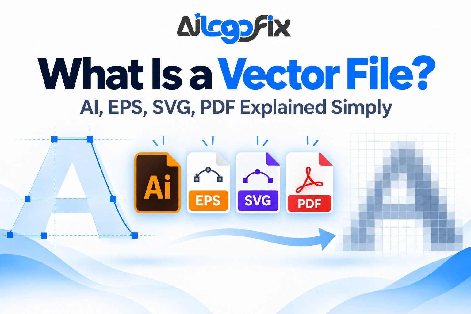
A brand-ready logo is not one file — it is the full package: vector masters (AI, EPS), print PDF (CMYK), web files (SVG, PNG, JPG), color variations (full color, black, white), and documented color values. Demand the complete set: what files you should receive.
Then put it to work: website header, social avatars, email signature, business cards. A logo only becomes a brand when it shows up consistently everywhere.
Common Founder Mistakes
Skipping the concept step. Going straight from napkin to software produces a clean version of a fuzzy idea. The five questions above are the cheapest design work you will ever do.
Over-detailing the sketch. Founders try to draw the final logo. Do not — draw the idea. Detail is the designer’s job; your job is the concept.
Settling for an auto-trace. Running your sketch through a one-click vectorizer gives you a lumpy copy of a rough drawing — the worst of both worlds. See why manual beats auto-trace.
Stopping at one file. A JPG of your logo is not a brand-ready logo. Insist on the full package before you consider the job done.
Have a Sketch? We Will Make It Brand-Ready
Send us your napkin sketch, whiteboard photo, or notebook doodle — our designers will refine the concept, vectorize it professionally, and deliver the complete logo package your brand deserves.
FAQs
Can a rough sketch really become a professional logo?
Absolutely — most professional logos started as rough sketches. The sketch captures the idea; designers supply the craft. Roughness is expected, not a problem.
Do I need to clean up my sketch before sending it?
No. Send the raw sketch plus your answers to the five concept questions. A clear phone photo in good light is all the “cleanup” needed at this stage.
How many concept revisions should I expect?
Typically 2–3 rounds: initial refined directions, your feedback, then final polish. More rounds usually mean the concept questions were skipped — answer them first.
Should I vectorize the sketch myself with free tools?
Free auto-tracers produce rough, uneditable results from sketches — fine for a mockup, not for a brand. The final vectorization deserves professional hands.
What does “brand-ready” actually mean?
A finished vector logo plus the complete file package (print, web, variations, color specs) — everything needed to use the logo consistently across every touchpoint.
How long does the full workflow take?
Concept refinement plus vectorization typically takes days, not weeks — the biggest variable is how quickly you give feedback between rounds.
The bottom line: Your napkin sketch is not the obstacle — it is the starting line. Capture it well, clarify the concept, get it professionally refined and vectorized, and demand the full package. That is the whole sketch to logo workflow, and it works every time.
Napkin Sketch to Logo: Complete FAQ
Turn a napkin sketch to logo the professional way. Founders doodle brilliant ideas on napkins, receipts, and notebook margins; this napkin sketch to logo FAQ shows how that rough spark becomes a brand-ready vector mark.
Can a rough napkin sketch really become a professional logo?
Absolutely. Some of the world’s most famous marks started as crude doodles. The napkin sketch to logo journey works because a sketch captures the idea while a designer supplies the craft: proportion, geometry, typography, and refinement. When you take a napkin sketch to logo professionally, the designer studies what makes your doodle distinctive, then rebuilds it with clean vector geometry. The idea stays yours; the execution becomes world-class. Never apologize for a rough sketch; clarity of concept beats drawing skill at this stage.
What should I do with my napkin sketch right now?
Photograph it immediately in good light, flat and straight, before the napkin disintegrates. That photo is step one of every napkin sketch to logo workflow. Then write down what the sketch means: what each element represents, the feeling you want, where you saw it in your head. When you hand a napkin sketch to logo designer your notes alongside the photo, you prevent misinterpretation. Email both to yourself as backup. A surprising number of great brands nearly lost their founding sketch to a laundry cycle.
How does a designer turn my sketch into a vector logo?
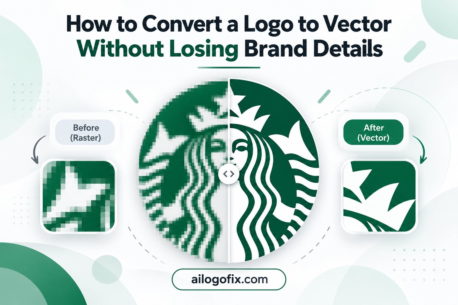
The napkin sketch to logo process has clear stages. First, the designer traces your concept’s structure, identifying the core shapes and idea. Second, they redraw it digitally with proper geometry: aligning curves, balancing weight, fixing perspective. Third comes refinement: simplifying details that will not survive small sizes, choosing typography that matches the mark’s personality, and testing the napkin sketch to logo concept in black, color, and reverse. Finally, the approved design is built as a true vector master with full file delivery. Your doodle’s soul survives; its wobbles do not.
How much of my original sketch survives the process?
The concept survives completely; the draftsmanship gets replaced. Think of napkin sketch to logo work as translation, not transcription. Your sketch says “a fox made of geometric triangles leaping over a wordmark”; the designer delivers that idea with professional precision. During napkin sketch to logo refinement, designers will show you concepts ranging from faithful to reinterpreted so you can choose how literal the final mark should be. Most founders are delighted: the logo looks like their sketch on its best day.
What if I cannot draw at all?
Then you are in excellent company. The napkin sketch to logo path does not require artistic skill; it requires a clear idea. Boxes, arrows, stick figures, and written notes like “eagle here, fierce not cute” are perfectly valid briefs. Designers are visual translators; a napkin sketch to logo specialist reads intention, not technique. Describe what you want the logo to communicate and who it must impress. That brief, plus your rough doodle, is everything a professional needs.
How long does napkin sketch to logo take?
Typically 1 to 3 weeks including concepts and revisions. The napkin sketch to logo timeline breaks down as: discovery and concept sketches (3-5 days), digital refinement of chosen directions (3-5 days), revision rounds (3-7 days), and final file preparation (1-2 days). Simple marks move faster; complex illustrated logos take longer. When you commission napkin sketch to logo work, agree the revision count upfront so the timeline stays predictable. Rush options exist, but great logos benefit from a little breathing room between rounds.
What will it cost to turn my sketch into a logo?
Professional napkin sketch to logo design ranges from $30 for a simple vector cleanup to $500+ for full brand identity. A straightforward napkin sketch to logo conversion, where your concept is clear and needs professional execution, sits at the affordable end. Full logo design with multiple concepts, typography, and brand guidelines costs more because it includes strategic thinking. Either way, the napkin sketch to logo investment is tiny compared to rebranding later because the first attempt was amateur.
6 Napkin Sketch to Logo Mistakes and How to Fix Each
Do not let these napkin sketch to logo errors sink a great idea.
1. Losing the sketch before documenting it. Napkins get thrown away; brilliance should not. Fix: photograph every napkin sketch to logo idea the moment it exists, and back it up to cloud storage. Future trademark filings may even need that dated original.
2. Over-detailing the sketch. Founders often cram every idea into one doodle, making the napkin sketch to logo brief unreadable. Fix: one sketch per idea. Draw three simple versions rather than one crowded masterpiece; the designer will thank you.
3. Insisting on literal translation. Demanding the final logo match every wobble of the sketch handcuffs the designer. Fix: treat napkin sketch to logo as collaboration. Approve the concept direction, then let the professional refine geometry, spacing, and typography.
4. Skipping the black-and-white test. A logo that only works in full color fails on fax, engraving, and single-color print. Fix: require your napkin sketch to logo designer to present every concept in solid black first. If the idea reads in black, color will only improve it.
5. Choosing typography as an afterthought. The sketch shows the icon; founders forget the wordmark matters equally. Fix: make typography part of the napkin sketch to logo brief from day one. Note fonts you like and the exact company name spelling, including capitalization.
6. No trademark check. Falling in love with a mark that already exists wastes the whole napkin sketch to logo effort. Fix: run a basic trademark search on your concept before finalizing. A designer can adjust direction early; rebranding after launch is brutal.
Great logos follow timeless principles: what makes a logo work and why vector format matters.
Pro Tips for Founders: Sketch to Brand
Maximize your napkin sketch to logo investment with founder-smart practices. First, sketch the problem, not just the picture. Write one sentence under your doodle: “This logo must make customers feel ___.” That emotional target guides every napkin sketch to logo design decision better than any visual reference. Designers who understand the feeling nail the mark faster.
Second, collect a swipe file before the designer starts. Save 10 logos you admire and 5 you hate, with one-line notes on why. This napkin sketch to logo companion material communicates taste instantly, cutting revision rounds dramatically. Taste is hard to describe but easy to show.
Third, think in systems from day one. Your napkin sketch to logo project should deliver not just a logo but the seeds of an identity: primary mark, simplified icon, color palette, and typography direction. Asking for the system now costs little extra and prevents the patchwork branding that plagues startups later.
Fourth, sleep on concepts. Never approve a napkin sketch to logo design the same day you see it. Print each option, pin them up, and glance at them over two days. The right mark keeps looking right; the trendy one starts to itch. Your gut needs time to vote.
When to Hire a Designer for Your Napkin Sketch
Your sketch captured lightning; now bottle it professionally. Hire a napkin sketch to logo designer when the idea deserves more than DIY.
You are fundraising or launching. Investors and customers judge credibility in seconds. A professional napkin sketch to logo execution signals that the business behind the idea is serious.
The concept is strong but the drawing is rough. This is the textbook napkin sketch to logo brief: great idea, shaky draftsmanship. A designer preserves your vision while adding the precision it needs.
You need more than a logo. Business cards, a website header, social avatars, packaging: a napkin sketch to logo project with a real designer delivers the full file set for all of it. Our logo design service takes founder sketches to complete brand-ready packages.
That napkin holds your company’s future face. Message our design team with a photo of your sketch and let’s turn napkin sketch to logo reality.
Founder’s Logo Glossary
Speak designer fluently during your napkin sketch to logo project:
Concept: A distinct creative direction for the logo, usually presented 3 at a time.
Wordmark: The company name set in custom or chosen typography.
Icon / mark: The symbolic part of the logo, separate from the name.
Lockup: The approved arrangement of icon plus wordmark.
Vector master: The infinitely scalable source file every napkin sketch to logo project must deliver.
Revision round: One cycle of feedback and changes on the design.
Brand guidelines: The rulebook for using the logo: colors, spacing, minimum sizes.
Trademark: Legal protection for your logo; search before you fall in love.
Bottom line: Every great brand started as someone’s rough sketch. Photograph your napkin, write down the idea behind it, and hand the napkin sketch to logo journey to a professional. Your doodle deserves better than a blurry photo; it deserves to become a logo.