
A logo can look perfectly sharp on a phone, website, or social-media profile and still fail when a printer tries to use it. The problem usually appears when the file is enlarged, converted for print, placed on a dark background, or sent to a production vendor that needs editable artwork.
In This Guide
- What Is a Print-Ready Logo?
- Why a Logo Can Look Fine on Screen but Print Badly
- Vector vs Raster for Printing
- Does a Print-Ready Logo Have to Be Vector?
- Which File Formats Are Common for Print-Ready Logos?
- RGB vs CMYK: Why Logo Colors Can Change in Print
- What About Pantone or Spot Colors?
- Logo Resolution: What Does 300 DPI Really Mean?
- DPI vs PPI in Practical Terms
- What Happens to Fonts in Print-Ready Logo Files?
- Transparency and Backgrounds
- Do Logos Need Bleed and Crop Marks?
- What Different Print Vendors May Need
- What Should I Send My Printer?
- How Can You Tell If a Logo Is Really Print-Ready?
- Print-Ready Logo Checklist
- Common Print-Ready Logo Mistakes
- Frequently Asked Questions
- Final Answer: What Is a Print-Ready Logo?
That is why printers, sign shops, packaging suppliers, apparel companies, and other production teams often ask for a print-ready logo.
A print-ready logo is not simply “a high-resolution image.” It is artwork prepared in the right format, at the right quality, with suitable color settings, typography, transparency, and production details for the specific job.
This guide explains what a print-ready logo really means, which files are useful, how RGB and CMYK affect color, what resolution matters for raster logos, and what you should send to a printer.
What Is a Print-Ready Logo?
A print-ready logo is a version of your logo that can be used reliably in professional production without forcing the printer or vendor to rebuild, guess, or repair the artwork first.
For many logos, that means having clean vector artwork that can be resized without losing sharpness, along with appropriate colors and properly prepared text. But print readiness also depends on the job.
A business card printer, screen printer, sign shop, packaging supplier, embroidery company, and vinyl cutter may not request exactly the same file type or color setup.
So the safest rule is:
Keep a clean master logo, then prepare the format required by the specific vendor.
Why a Logo Can Look Fine on Screen but Print Badly
Computer and phone screens are forgiving. A small raster logo may look sharp because it is displayed at a relatively small size.
When that same file is enlarged for a poster, sign, vehicle graphic, packaging panel, or T-shirt, the available pixels are stretched across a larger physical area. The result may look blurry, jagged, or soft.
Other problems can appear too:
- Colors may print differently from what you see on screen.
- A white background may appear around a logo that should be transparent.
- A printer may not be able to edit or separate colors.
- Fonts can change if the correct typeface is missing.
- Thin details can disappear in certain production processes.
- A PDF or EPS may still contain a low-resolution image instead of true vector artwork.
These issues are why “print-ready logo” describes the actual condition of the artwork, not just its filename.
Vector vs Raster for Printing
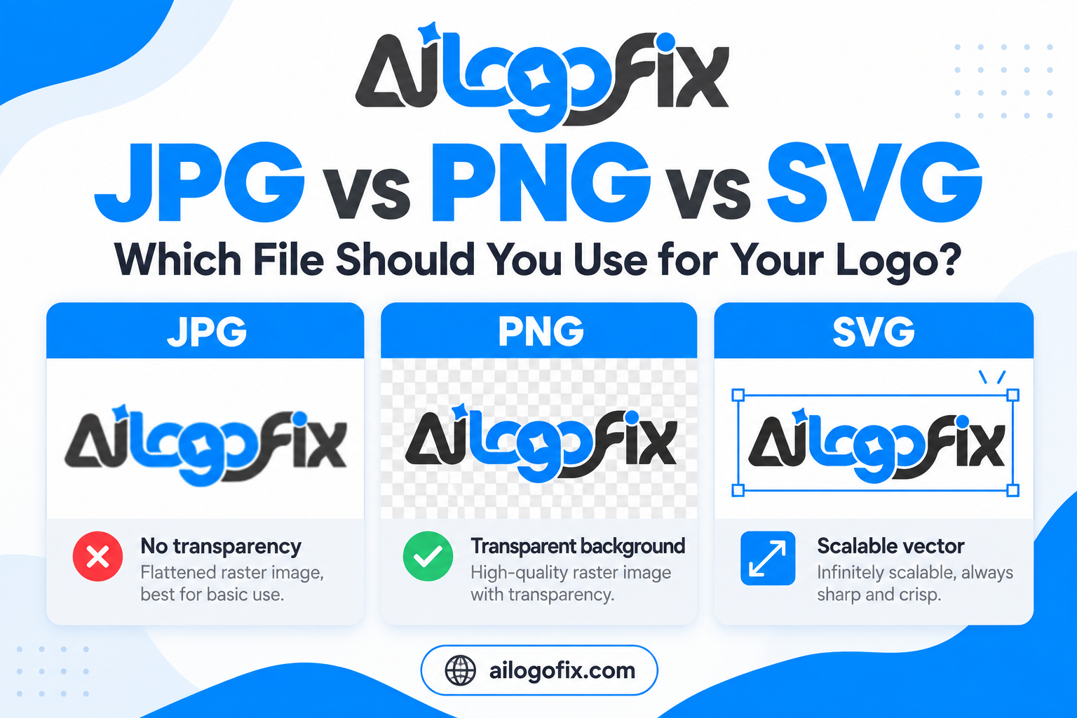
Logos are usually best kept as vector artwork because vector shapes can be resized without the same pixel-resolution limits as JPG or PNG files.
Vector artwork is built from mathematical paths, curves, and shapes. A clean vector logo can be used at small stationery size and then scaled for a storefront sign without becoming pixelated.
Raster formats such as JPG and PNG are made from pixels. They can still print well when the resolution is high enough for the intended physical size, but their quality is tied to the number of pixels available.
If you want a deeper explanation of these differences, see What Is a Vector File? AI, EPS, SVG & PDF Explained Simply.
Does a Print-Ready Logo Have to Be Vector?
Not always, but vector is usually the most flexible choice for logos.
A high-resolution raster image can be acceptable for a specific print size. For example, a large enough PNG may print cleanly on a small label or document.
However, if the logo needs to be resized, recolored, separated for production, simplified, or reused in many different applications, vector artwork is much safer.
If your current logo only exists as a small JPG or PNG, simply changing the extension to SVG, PDF, EPS, or AI does not make it truly vector. The artwork itself must contain clean vector paths.
Our guide on how to convert a logo to vector without losing brand details explains the proper reconstruction process.
Which File Formats Are Common for Print-Ready Logos?
| Format | Type | Transparency | Best Print Use | Important Caveat |
|---|---|---|---|---|
| AI | Vector-capable | Yes | Editable master artwork, professional production | Can contain raster images too |
| EPS | Vector-capable | Depends on workflow | Print, signage, apparel, older production systems | Can contain raster content |
| Vector/raster container | Possible | Printer handoff, proofs, production documents | A PDF is not automatically vector | |
| SVG | Vector-oriented | Yes | Digital use and some modern workflows | Can embed raster images |
| PNG | Raster | Yes | Transparent previews and certain digital/print uses | Resolution-dependent |
| JPG | Raster | No | Simple previews and fixed-size use | Lossy compression and no transparency |
Different vendors have different print-ready logo requirements. A sign company may ask for EPS or PDF, while another printer may prefer AI or a specific PDF standard.
Always ask the vendor what they want before sending final production files.
RGB vs CMYK: Why Logo Colors Can Change in Print
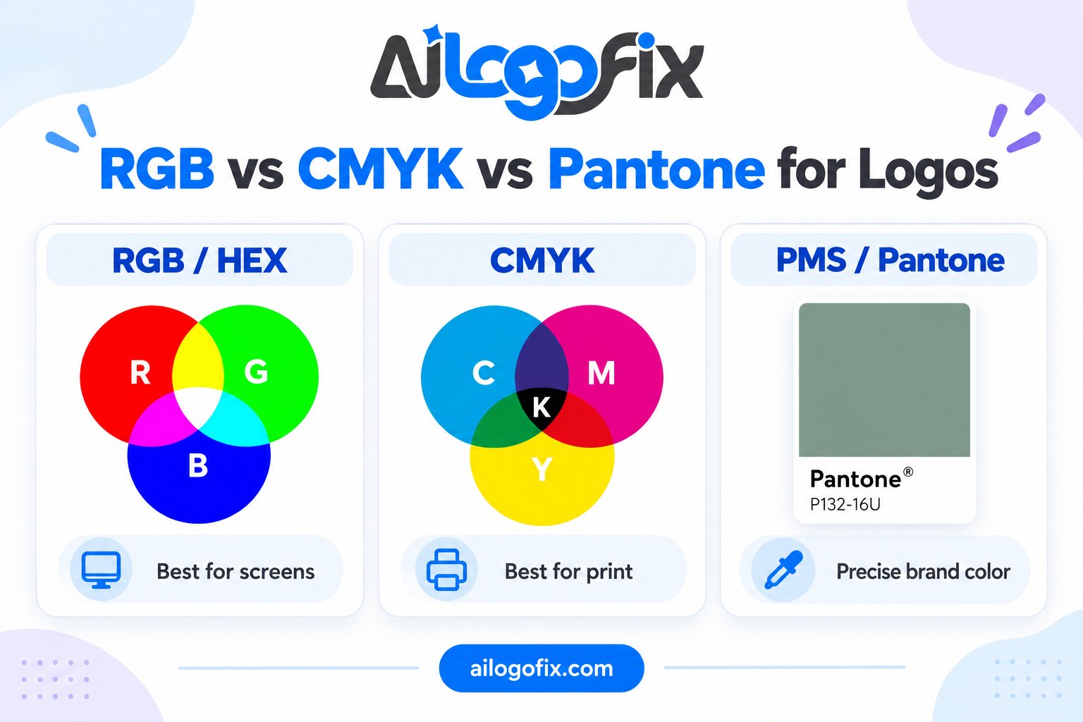
RGB and CMYK are different color systems used for different environments.
RGB uses red, green, and blue light and is designed for screens. Websites, phones, monitors, and many digital platforms use RGB.
CMYK uses cyan, magenta, yellow, and black inks and is common in commercial printing.
Some bright RGB colors cannot be reproduced exactly with standard CMYK inks. That is why a logo that looks very vivid on a screen may appear slightly different in print.
A print-ready logo workflow should consider the intended printing process instead of assuming a simple color conversion will always produce the perfect result.
If your printer provides a specific color profile or asks for CMYK artwork, follow that instruction.
What About Pantone or Spot Colors?
Pantone and other spot-color systems are sometimes used when a brand needs consistent, repeatable color across specific printing processes.
A printer may request a Pantone reference for stationery, packaging, screen printing, or other production where a defined spot color is useful.
But not every project requires Pantone colors. Digital printing often uses process color instead.
The important point is not to guess. If the brand already has documented Pantone values, use them. If not, confirm with the printer before assigning a spot color based only on how a screenshot looks.
Logo Resolution: What Does 300 DPI Really Mean?
“300 DPI” is often treated as a universal rule for print, but the subject is more nuanced.
Raster artwork has a fixed number of pixels. Its effective print quality depends on how those pixels are distributed across the final physical size.
For example, the same image might have plenty of detail when printed small but become visibly soft when stretched across a large poster.
Simply changing the resolution metadata from 72 to 300 does not create new visual detail. If the original image contains too few pixels, typing “300 DPI” into a settings box does not magically rebuild the missing information.
Vector artwork is different. Vector paths are resolution-independent, so they can be rendered sharply at the required output size.
This is one reason vector files are so valuable for logos.
DPI vs PPI in Practical Terms
PPI generally refers to pixels per inch in a raster image. DPI is often used when discussing the output resolution of a printer.
In everyday client conversations, people frequently use the terms interchangeably, but the important practical question is:
Does the raster artwork contain enough detail at the final print size?
If not, increasing the numeric DPI setting alone will not solve the problem.
What Happens to Fonts in Print-Ready Logo Files?
Typography can create another production problem.
If a logo uses a font and the printer does not have that font installed, the text can substitute or display incorrectly when the file is opened.
For final logo delivery, designers often convert logo lettering to outlines. This turns the letters into vector shapes so the appearance no longer depends on the font being installed.
However, it is sensible to keep an editable master version before outlining the type, especially if the wording may need to change later.
Custom wordmarks may already be drawn as vector shapes rather than live text.
Transparency and Backgrounds
A professional print-ready logo master should usually be able to work without a forced white rectangle behind it.
Vector formats can support transparent areas, and PNG is useful for transparent raster exports.
JPG does not support transparency, so it will usually contain a background color.
For print production, whether transparency should be preserved, flattened, or handled another way depends on the final workflow and vendor.
Do Logos Need Bleed and Crop Marks?
This is a common area of confusion.
The standalone print-ready logo itself usually does not need bleed or crop marks.
Bleed, safe area, and crop marks normally belong to the final layout being printed, such as a business card, flyer, brochure, sticker sheet, package, or label.
For example, if the logo is placed close to the edge of a business card, the business-card document may need bleed. The logo master does not need permanent crop marks added around it.
This distinction is important because adding print-layout marks directly into the logo file can make the master artwork harder to reuse.
What Different Print Vendors May Need
Business Cards and Stationery
A clean vector print-ready logo is ideal. The final card or stationery layout may be delivered as print-ready PDF with the printer’s requested bleed, color profile, and crop settings.
Brochures and Flyers
The logo should be placed into the full layout at appropriate quality. The document—not the logo itself—usually controls bleed, crop marks, and page size.
Packaging and Labels
Packaging suppliers may request vector artwork, CMYK or spot colors, outlined fonts, dieline-safe placement, and other production-specific requirements.
Signage and Vehicle Graphics
Vector artwork is strongly preferred because logos may be enlarged significantly. Clean paths make scaling and production easier.
Screen Printing, Apparel and DTF
Requirements vary by printer. They may need vector artwork, high-resolution raster files, separated colors, or simplified shapes depending on the printing method.
Embroidery Preparation
A vector logo can be a good starting reference, but embroidery uses stitch data rather than ordinary vector paths. Small details may need simplification before digitizing.
Vinyl Cutting, Laser or Engraving
These workflows often benefit from clean, simplified vector paths. Excess anchor points or overlapping shapes can make production harder.
What Should I Send My Printer?
The first step is simple: ask the printer what they prefer.
A practical print-ready logo package may include:
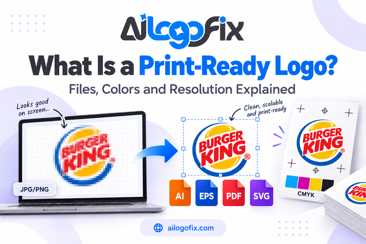
- A clean AI, EPS, or vector PDF master.
- An SVG where useful.
- A transparent PNG for easy previewing.
- A JPG preview if needed.
- Official color references if your brand has them.
If the printer has provided a template, color profile, bleed requirement, or preferred PDF setting, use their specification rather than guessing.
How Can You Tell If a Logo Is Really Print-Ready?
Open the file in professional design software and inspect the artwork.
A strong print-ready logo should generally have clean geometry, accurate typography, correct colors, and a format appropriate for the vendor.
For vector artwork, individual paths and shapes should be selectable and editable. If an AI, EPS, PDF, or SVG file contains only one embedded pixel image, it is not the same as a properly rebuilt vector logo.
If your logo contains hundreds of rough auto-traced nodes, uneven curves, or damaged lettering, it may technically be vector but still not be professionally prepared.
Our comparison of manual vector tracing vs auto trace explains why path quality matters.
Print-Ready Logo Checklist
- The logo is sharp at the required output size.
- A clean vector master exists where appropriate.
- The logo is not simply a low-resolution image embedded inside a PDF, EPS, AI, or SVG.
- Typography is protected from font substitution.
- Colors match the intended print process.
- Official brand color references are used when available.
- Transparency/background treatment is appropriate.
- The file opens correctly in the vendor’s workflow.
- The artwork has been checked at both small and large sizes.
- The vendor’s specific file, color, and production requirements have been followed.
Common Print-Ready Logo Mistakes
- Sending only a small JPG and expecting it to scale cleanly.
- Changing “72 DPI” to “300 DPI” without adding real image detail.
- Assuming every PDF, EPS, SVG, or AI file is automatically true vector.
- Sending RGB artwork when a printer specifically requests CMYK.
- Converting colors without checking how the result looks.
- Leaving important logo text dependent on a missing font.
- Using a screenshot instead of the original artwork.
- Adding bleed and crop marks directly to the standalone logo instead of the final print layout.
- Ignoring the printer’s own file specifications.
Get a print-ready logo without the guesswork.
If your logo only exists as a blurry JPG, PNG, or screenshot, the AiLogoFix specialist team can manually rebuild it into clean, scalable vector artwork — ready for printers, sign shops, and packaging vendors.
With 4000+ projects completed and unlimited revisions, you get production-ready files prepared for the exact workflow your printer needs.
Message the Team Send us your current logo file and tell us how you plan to use it.
Frequently Asked Questions
What file format is best for a print-ready logo?
There is no single best print-ready logo format for every printer. AI, EPS, and vector PDF are commonly useful for professional production, while SVG may be useful in some workflows. Ask the vendor what they prefer.
Is a 300 DPI PNG print-ready?
It can be, if it contains enough pixels for the intended physical print size and the vendor accepts raster artwork. A low-resolution image does not become detailed simply because its metadata says 300 DPI.
Can I print my logo from a JPG?
Yes, if the JPG is large enough and the print size is modest. For scalable, editable, or production-critical use, vector artwork is usually more flexible.
Is PDF always print-ready?
No. A PDF can contain low-resolution raster images, RGB colors, missing fonts, or unsuitable artwork. Print readiness depends on the contents and the printer’s requirements.
Should my logo be RGB or CMYK?
RGB is appropriate for screens. Many printers use CMYK workflows, but requirements vary. Follow the specific printer’s instructions and use documented brand colors where available.
Do I need Pantone colors?
Not always. Pantone or other spot-color references are useful in certain production workflows where controlled spot colors are required. Many digital print jobs use process color instead.
Can AiLogoFix make my blurry logo print-ready?
If the design is recognizable, our team can manually recreate it as clean vector artwork through our Raster to Vector service. The final production requirements should still be confirmed with your printer or vendor.
Final Answer: What Is a Print-Ready Logo?
A print-ready logo is artwork prepared so a professional printer or production vendor can use it reliably at the required size and in the required workflow.
That usually means clean vector artwork, appropriate file formats, suitable color settings, protected typography, and careful attention to the vendor’s specifications.
For print-ready logos, resolution matters for raster files, but “300 DPI” alone cannot repair a low-quality image. CMYK is common in print, but not every printer works exactly the same way. AI, EPS, PDF, and SVG can all be useful, but the extension alone does not guarantee clean vector content.
The most reliable approach is to keep a professional vector master and create the required production file from it.
If you only have a blurry or low-resolution logo, visit our Raster to Vector Service or Message Us. We can help rebuild the artwork into a cleaner, more usable logo file for future print and design work.
Remember: A true print-ready logo uses vector paths, CMYK color, and correct bleed. If your file is missing any of these, it is not really a print-ready logo yet. Get your print-ready logo prepared properly — message our team for print-ready files done right.